THIS IS A GENRE OF PHOTOGRAPHY WHEN THE SUBJECT DOESN'T MOVE SUCH AS FRUIT AND FLOWERS. THE SUBJECTS ARE MUCH SMALLER AND OFTEN IN SMALL GROUPS. THEY ARE STILL LIFE FORMS BUT THEY DON'T MOVE.
CAROL SHARP
Carol Sharp is an award-winning photographer and fine artist known for her lyrical compositions, finer details and way with light. Carol Sharp's photos are of simplistic flowers that are edited to look more intricate. She also uses black and white filters to make her images more unique, these filters give her work an ominous and unearthly feel which is ironic considering her work centres around nature. Her images range from bright, authentic pictures to black and white, interesting images. A lot of her images focus on drawing attention to one flower by blurring the background, sharpening the subject and highlighting the subject.
examples of her work:

|
|
|

|
ANNOTATIONS:

|
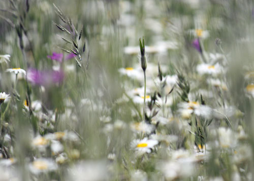
When I first saw this image I thought it was quite simplistic but interesting in the sense that it captures the intense colours. This image made me think about nature and floral designs. It captured my attention because of the bright coloured flower but darker, blurred background. In this image there is a still life flower with a blurred background to draw more attention to the flower. This image is modern and realistic. I think that this photograph was taken outside because the flower has raindrops on it and the dark silhouette in the background looks like a blurred tree. When looking at this image , it reminds me of when rain stops and the sun begins to shine. I can smell a damp smell as rain has just stopped and I can also hear rain drops trickling of tree leaves. The subject of this image is natural forms and in this case a flower. I know this through the colour intensification and blurred background to make the flower stand out.
|
My edited Photographs Linked To The Photographer; Carol Sharp
CAROL SHARP'S WORK:
|
MY WORK: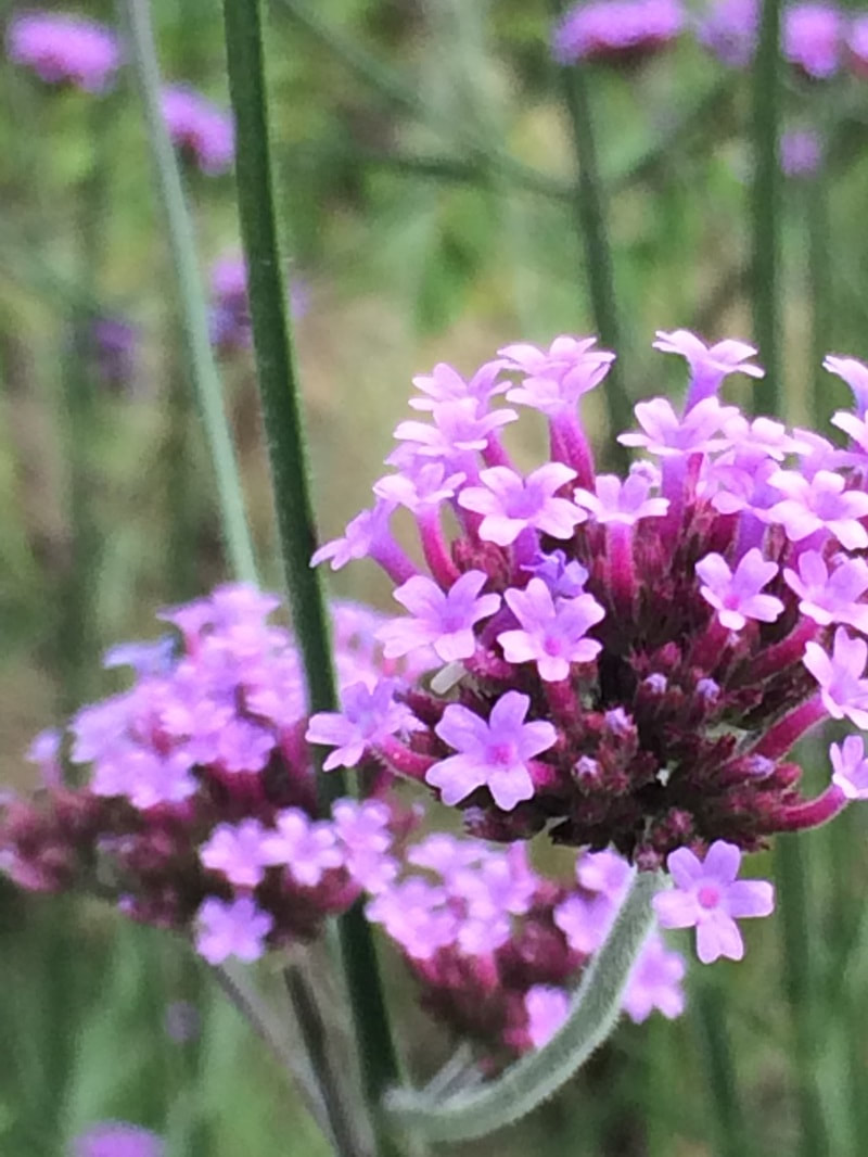
|
I have edited the image 1 to resemble certain features of image 2 taken by Carol Sharp . Carol has slightly blurred the background to draw more attention to the flower and make the flower the subject of the photograph. Also I have overexposed the flower to make the flower brighter and emphasise the vividness of the petals. When editing my image, I also sharpened the edges of the flower to make the image smooth and realistic. Carol also took the picture very close to the flower to bring extra focus to that subject. I also took the picture very close to the subject to make sure it gets full attention. If i was to retake this image, I would definitely use a camera in order to make the image less blurry.
CAROL SHARP'S WORK: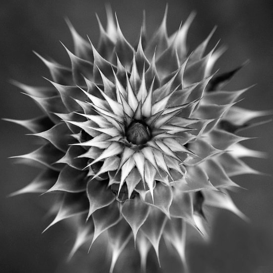
|
MY WORK: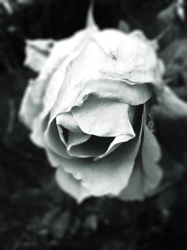
|
I edited my image to resemble Carol's image by highlighting the plant and darkening the background. By doing this, I have made the plant in the centre the subject of the image just like Carol Sharp did. I used the dodge tool to help emphasise the highlights, mid tones and shadows of the picture. I also sharpened the edges of the petals to make the flower seem more realistic and focused. In order to improve this I would potentially use a different flower in order to create the sharp edges she focused on in her work.
carol sharp's work: |
my work: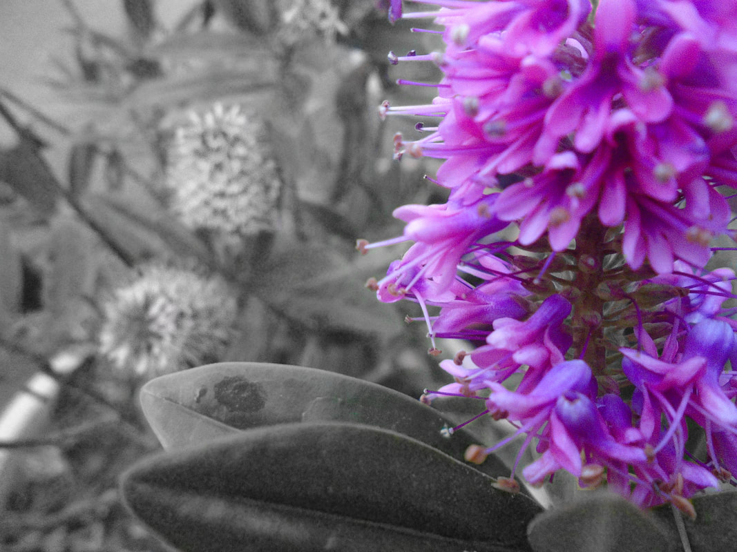
|
I merged the features of Carol Sharp's images to create my work. I used the black and white filter to draw attention to one of the flowers but like Carol Sharp, I didn't use harsh black and whites, I used softer greys. The dodge tool was also used to highlight the flower and make it a lot more vibrant like Carol Sharp did in the first image. I also blurred the background to draw extra attention to the flower as the majority of her images focus on one subject.
More edited images in the style of carol sharp:


IMAGE 1

PROCESS
mY UN-EDITED IMAGES IN STYLE OF CAROL SHARP:
|
|
Carol Sharp uses a lot close up images consisting of very cool tones. She also uses rule of third and macro photography which inspired my final outcome. When taking these photographs, I considered the viewpoints and sharpness of the resolution.
|
allan wallberg
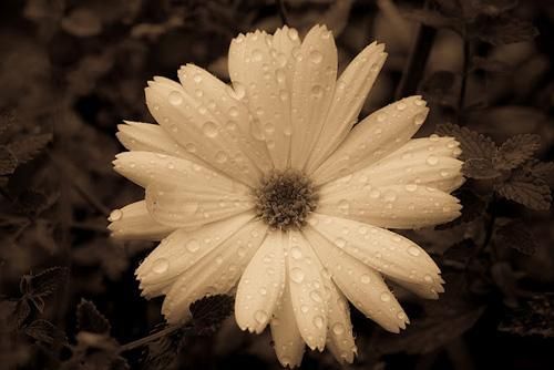
Allan is a retired worker of the Pre Press who now shoots pictures of wildlife. Allan Wallberg takes a range of landscape and portrait images. In most of his images he focuses on one specific object and uses filters to draw attention to it. He specialises in natural forms photography and his photos range from flowers to animals. Some of his images are darkened but others are of brightly coloured flowers using natural lighting.
examples of his work:

|
|

|

|
annotations:
|
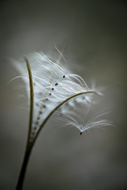
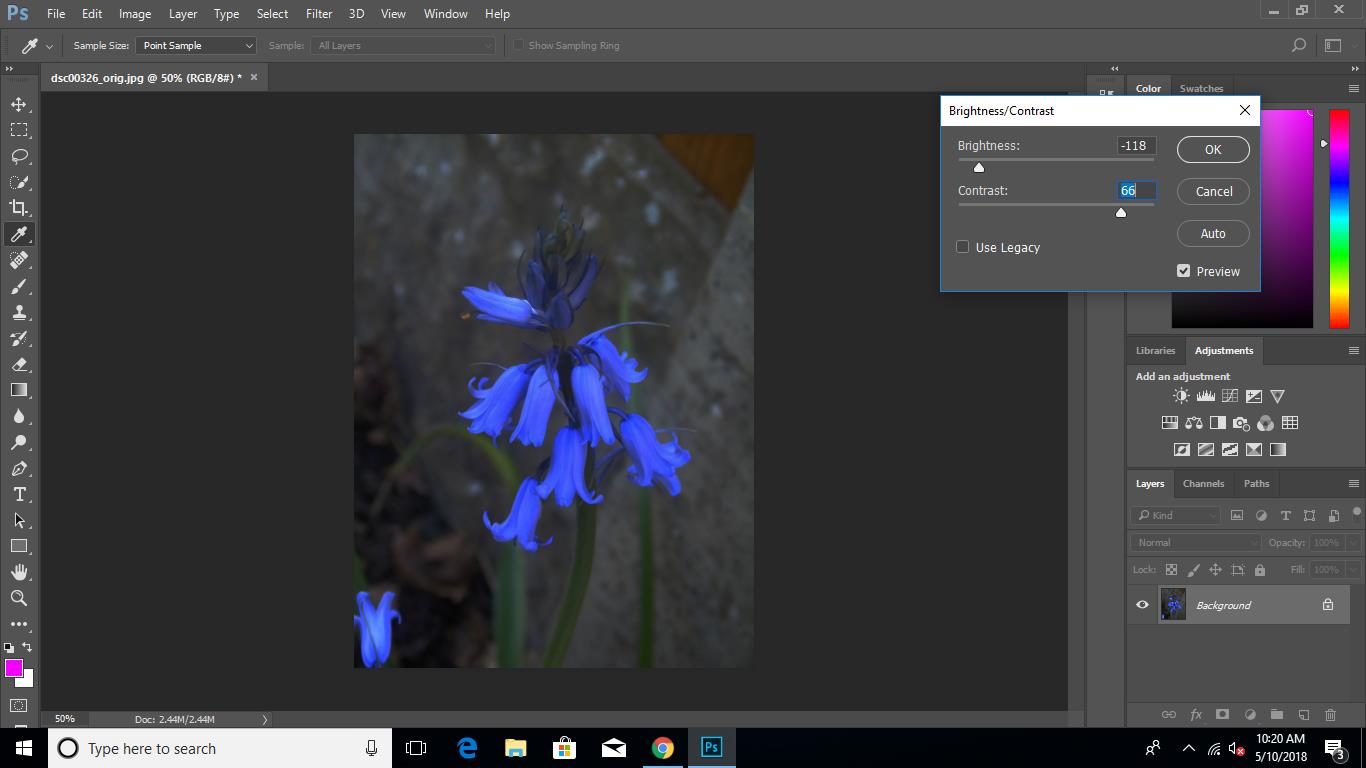
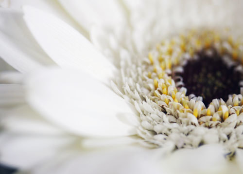
After studying this image, I thought that the rustic background made the flower appear even more delicate and contrasted with the background. Also instead of using a simple black and white contrast, a black with a dark brown tinge was used. this emphasised the authenticity of the image and helped capture every detail of the white flower.
|
MY edited PHOTOGRAPHS LINKED TO THE PHOTOGRAPHER; ALLAN WALLBERG
ALLAN WALLBERG'S WORK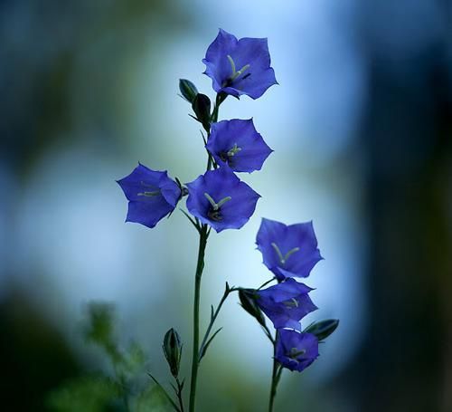
|
MY WORK: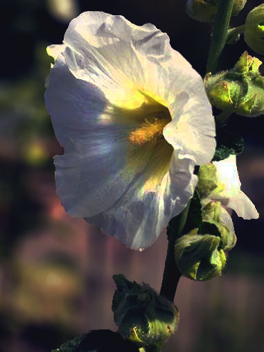
|
I have edited my work to resemble some features of Allan's image. I used field blur to draw more attention to the subject of the image. Allan's image also has a darkened background so I darkened the image to compliment the subject. I also used the dodge tool to highlight certain features of the flower that I wanted to draw more attention to.
allan wallberg's work:
|
my work: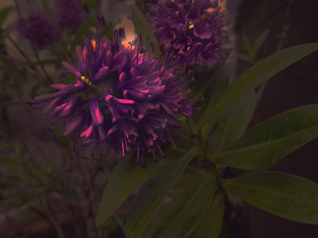
|
I have edited image 1 to resemble the antique filter of image 2. I used the dodge to highlight the flower and I lowered the hue saturation to give the photo an overall antique affect. I tried to mirror the rustic feel of Allan's image in my own work.
allan wallberg's work: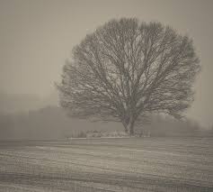
|
my work: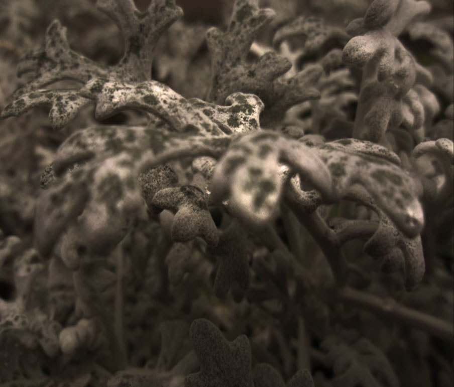
|
I have edited image 1 to resemble certain features of Allan's work which is image 2. I adjusted the hue saturation to darken the image to give it the overall mysterious feel that Allan was trying to create. I also highlighted the centre plant to draw more attention to it as Allan only ahs one subject in his image.
MORE EDITED IMAGES
PROCESS
My un-edited photographs in the style of this photographer:
|
|
When taking these images, I considered the darkness of the pictures and the viewpoints. I reflected his use of one main subject onto my own work.
|
PIRJO KEENE
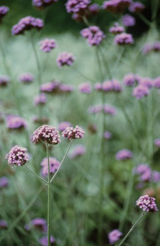
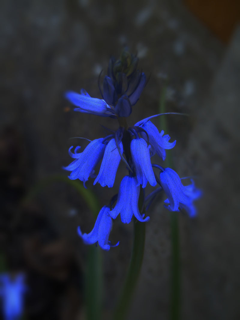
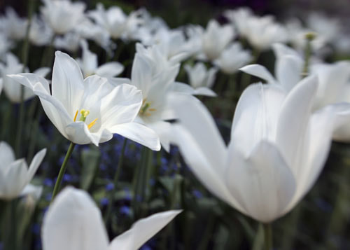
Pirjo Keene is a member of The Royal Photographic Society and she has participated in many Open Studio Art events. I have chosen Pirjo Keene because I like the way she focuses on one flower and blurs the surroundings. She also makes a certain flower the centre of the image. In some of her photos she filters them to make them look painted. All of her images have natural lighting which makes the image look more authentic. In her images she only exaggerates a few aspects of the photograph keeping it relatively realistic. Although her images have different editing techniques within, they all portray vibes of summer and when looking at her photos, they are luminescent and pure. After looking at these images I can tell the Pirjo has a close relationship with nature. Pirjo Keene uses a lot of bright and fresh colours in her work which I tried to reflect in my own work. She takes quite up close and personal images focusing on mainly one subject. When taking my images, I considered the natural lighting and the viewpoint of my chosen subject to reflect on her style.
examples of her work:

|
|
|
|
annotations:
|
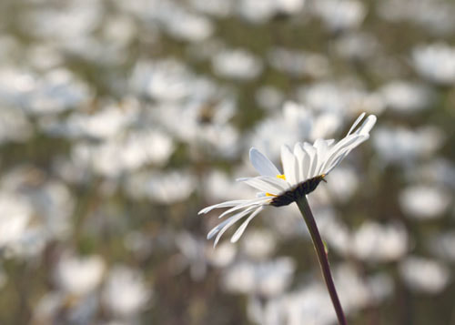
This image is an example of macro photography. When I first saw this image I was immediately draw to the centre of the flower where the most focus was put. I liked the way the blurred the petals that were furthest from the centre of the flower. I also think the sharpness of the petals closer to the centre of the flower and the blurred petals further away work together to draw all the attention to the simplicity of the flower.
|
my edited photographs linked to the photographer; pirjo Keene
pirjo keene's work:
|
my work:
|
I have edited my image to resemble certain features of Pirjo Keene's work. I edited the picture on Photoshop, using the dodge tool to highlight the centre of the flower to draw the most attention to it just like Pirjo did. I slightly blurred the front petals but not as much as Pirjo did as I had fewer petals to distract from the centre. I also adjusted the brightness of the image to make the flower look more delicate.
PIRJO KEENE'S WORK: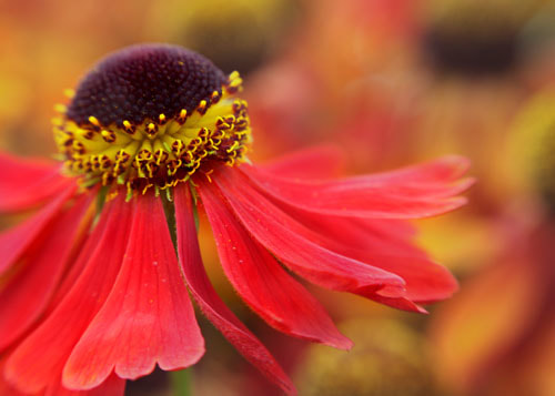
|
MY WORK:
|
I have edited my image to reflect the colours and effect of Keene's work. I used the dodge tool to highlight certain parts of the flower but I used natural lighting and kept the rest of the image unedited to keep the focus on the simplicity of the flowers. In Pirjo Keene's image, it looks like the wind is blowing through the petals which is why I took the image outside to link my image to the photographers. If I was to retake this image, I would use a camera instead of an iPad in order to create a clearer resolution as my image is slightly blurry.
pirjo keene's work: |
my work: |

|
|
I have edited this image in order to resemble the editing style of Pirjo Keene. In order to edit this image, I increased the brightness to create the same fresh and pure atmosphere from the image that Pirjo Keene infers from the picture. I attempted to make the flower look more delicate as Pirjo's images are quite bright and there is a certain softness inflicted on the petals of all of the flowers within his work. I also blurred the background of the image in order to emphasise the focus on the flower as there is only one subject in most of his images. If I was to take this image again, I would take the image in a brighter place as the the leaves in the background are slightly dark.
more edited imAGES IN THE STYLE OF PIRJO KEENE:
IMAGE 1

PROCESS


IMAGE 2

PROCESS
More edited images in the style of pirjo keene: "Close ups"


my unedited images in the style of this photographer:
|
|
When taking these images, I considered the brightness of every image as Pirjo Keene's images have very intense natural light to make the image more authentic and more raw.
|
DESIGN IDEA 1:
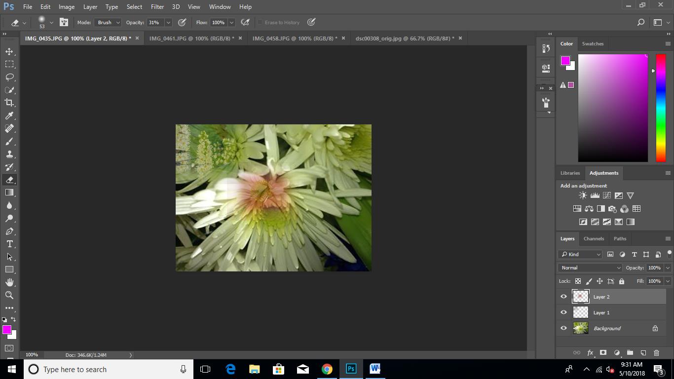
For my first design idea, I wanted to layer a selection of my best images in the style of all my artists on top of each other each of a different opacity.
process:
Step 1: I chose one of my images that had very understated colours so that the layered images would stand out more. I then copied and pasted another photograph onto it.
Step 2: I then selected the eraser tool and lowered the opacity to under 30% and erased the image lightly more transparent.
Step 3: I repeated this with multiple photographs each of a different colour and tone until I covered the entire base image.
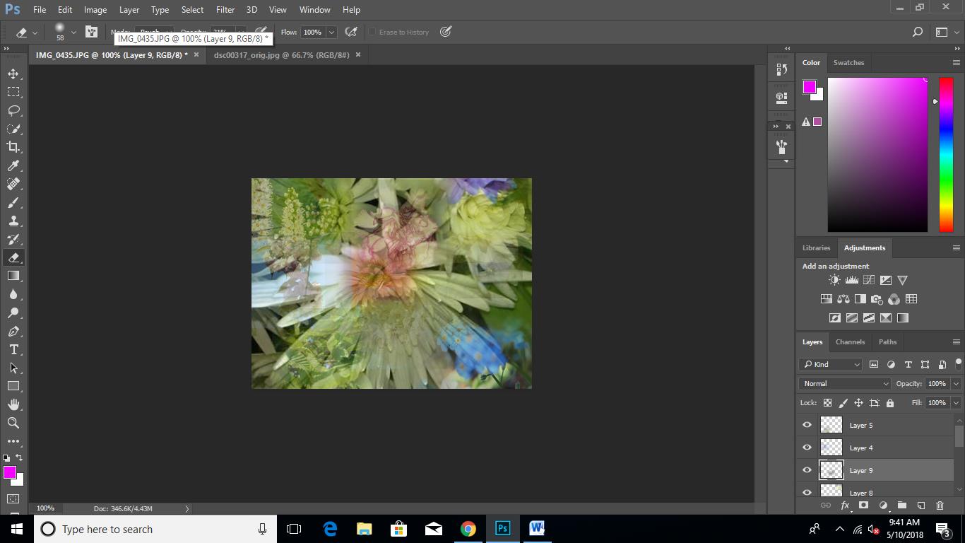
Step 4: Lastly, I changed the hue saturation of the entire photograph to make the piece more bright and vivid.

DESIGN IDEA 2
For my design idea 2, I wanted to make a very simple and clean collage with alternating colour flowers, coloured flowers being in the centre and white along the sides.
process
Step 1: I copied and pasted 6 equally sized images onto a canvas, placing two coloured flowers in the centre.
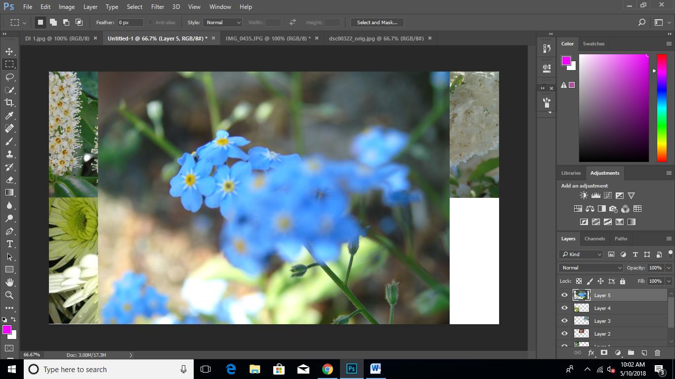
Step 2: I then changed the hue saturation of the entire collage to make the image a lot more vivid and luminous.
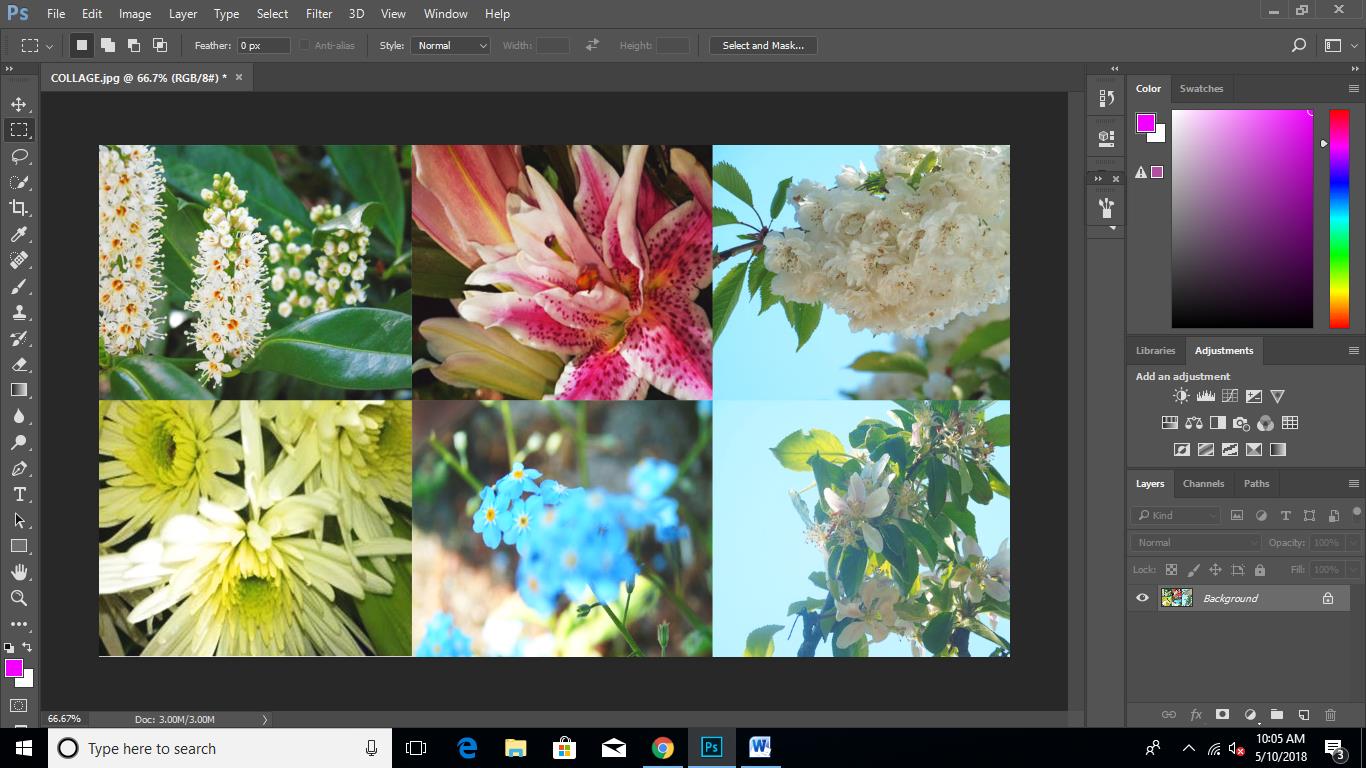
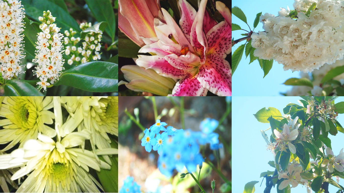
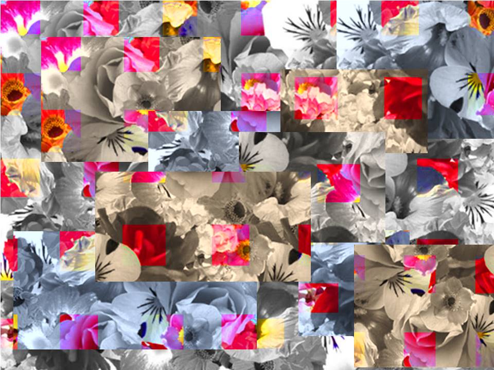
FINAL OUTCOME
My first idea was to create a collage of all of my different images with contrasting warm and cool colours. I wanted to put flowers of a warm tone on the left and cool tones on the right so that they clash in the centre of the of the page.
PROCESS OF this idea
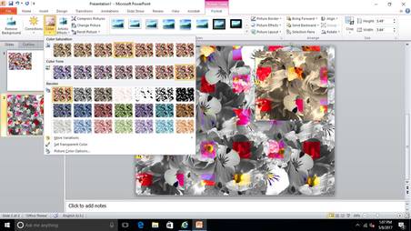
MICROSOFT POWERPOINT:

|
I have clipped certain flowers from my edited images to create a small collage using Microsoft PowerPoint. I used a lot of cool colours with very few warm colours to contrast.
|

|
Once I was happy with the arrangement of the flowers, I copied and pasted the small collage to make a bigger one which I then saved and edited on Photoshop.
|
adobe photoshop

|
I measured out equal squares across the collage and changed the hue saturation to make the square more vibrant and modern. With the remainder of the collage which had not been edited, I turned black and white using a filter.
|
MICROSOFT POWERPOINT:
|
Due to some issues with Photoshop, the remainder of my editing had to be done on Microsoft PowerPoint. I copied my collage a few times, each time cropping different sections of it out. With each different section, I changed the colour to give it a cool or warm tint. I layered the different tinted sections onto my original, edited collage to create my final piece. I have used cooler and warmer tints to contrast with each other but I have kept the coloured cubes the same to compliment and tie the piece together.
|
|
I have taken inspiration from Carol Sharp and Picasso. I incorporated Carol Sharp's technique of using blur and softer black and whites for my filter. However when coming up with my final idea, I found that my idea related to Picasso's Cubism so I found even more inspiration within his work. To create my final outcome, I merged the two concepts together to come up with my own modern and clinical take on Cubism.
|
HOW DOES MY FINAL PIECE RELATE TO MY ARTISTS?
WORK THAT INSPIRED MY FINAL OUTCOME:
|
|
carol sharpThe last the 3 images show the a variation of Carol's work ranging from her brighter more vibrant work to her ominous, black and white work. I found inspiration from image number 4 to colour certain parts of my" Modern Take On Cubism" and in the black white images to use those filters. Overall Carol Sharp inspired the contrasting elements in my work, playing a huge part in the overall effect
|
pablo picassoThe first 3 images reflect the style of cubism. Cubism is an early 20th century style of art which uses simple geometric shapes, interlocking planes and most recently collage which is what I have used in my final outcome.
|
SELF EVALUATION-
I am happy with my final outcome, however I was unable to use Photoshop often therefore my images were limited in expression. To improve, I would use my time more effectively and come up with an alternative idea as a back up. Although I managed to finish my final outcome, I feel as though I did not plan as well as I could have which affected my outcome in the long term.
If I was to do this project again, I would plan ahead as it would make the exam go a lot more smoothly and I would have ended up with a better final piece.
If I was to do this project again, I would plan ahead as it would make the exam go a lot more smoothly and I would have ended up with a better final piece.
