What is portraiture photography?
This a type of photography which revolves around taking carefully thought out images to show a person's distinguishing features whilst capturing their attitudes and personality.
researching the title: portraiture photography
Facial expressions:
|
|
When researching different facial expressions within portraiture photography, the most common expressions were: 1)Shocked
2) Frightened 3) Upset 4) Joyous 5) Anger 6) Loss |
body positions:
|
|
Standing up body positioning: When researching this body position, there were very basic portraiture images which made the image more authentic and intimate whereas when I continued further, I found some very complex interpretations of the stance. For example there were reflective images and images where text played a part within the image which made them seem more creative and contemporary.
|
|
|
Jumping body positioning: When researching this body position, I found that there were very different focuses within each portraiture image. Some of the photographs focused more on the background of the setting and not so much the person in the photograph which made the images more naturally beautiful. On the other hand some images blurred out the background and focused more on the person jumping which made the image more intimate. There were also several different viewpoints which gave the photographs different meanings. For example if the image was taken from a low viewpoint, it would make the viewer feel more intimidated and feel like they are being watched.
|
|
|
Sitting down body positioning: When researching this, I found that there were very different tones of lighting and several different facial expressions within the search . For example, some were taken in a darker light which made the atmosphere of the image change to more mysterious and sinister.
|
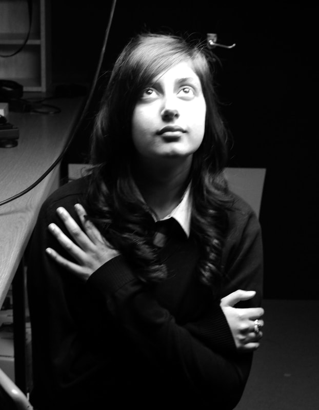
My own images: unedited
|
|
EUGENE RICHARDS
|
|
Victor Bezrukov is a freelance photographer who uses both analogue and digital formats of photography to produce BW film. He is also an IT specialist and security consultant. Victor has not yet decided which type of subject he loves to photograph but some of his work are black and white, street, miksang, portraiture and landscapes. He likes to bring some kind of dramatic aspect to his work using contrasts, happiness, emptiness, craziness and melancholy.
|
|
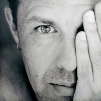
The main focus of this image is the subjects eyes as they are staring directly into the camera and they have a luring gleam.However this image is actually quite interesting and captivating because the subject is showing no emotion which makes the viewer think about what his neutral emotion could represent. This is a black and white image which emphasises the fact that the subject has a neutral facial expression as the black and white filter will blur away any emotion that may be represent.
|
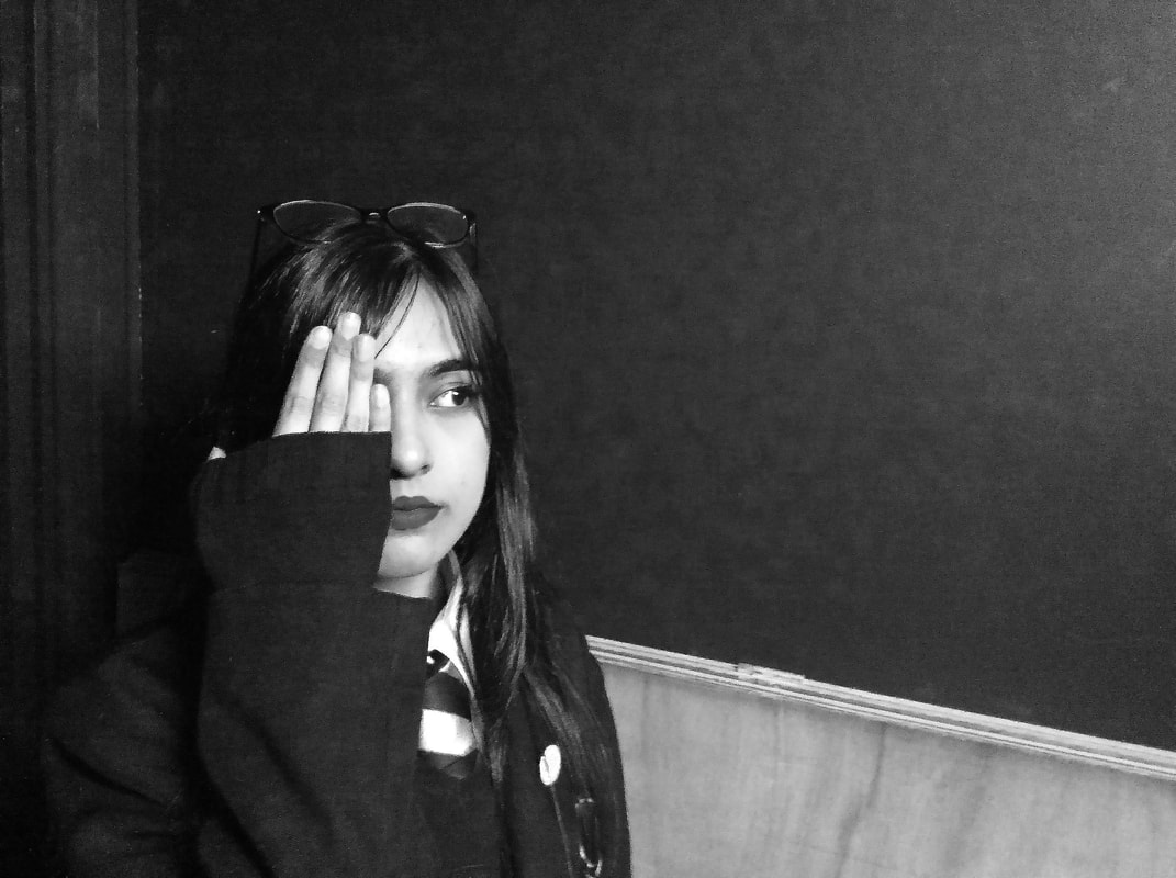
my edited images in the style of VICTOR BEZRUKOV:
PHOTOGRAPH 1:
my work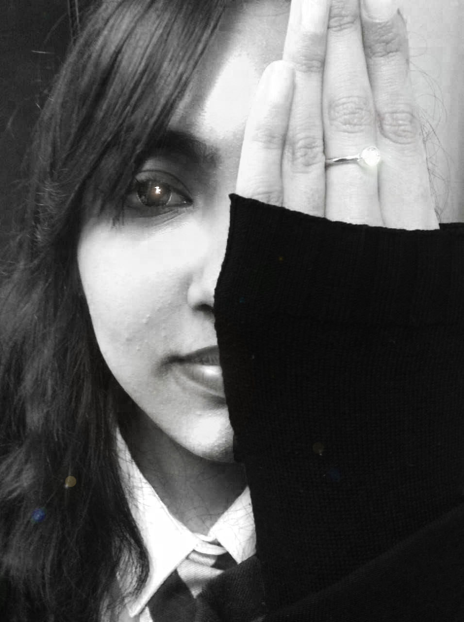
|
artist's work
|
I have edited my image to resemble certain features of the image which was taken by Victor Bezrukov. I used the dodge tool to highlight the hair and eye to create the illusion of the sun shining in her eyes. I also used the Lens Flare filter to add a gleam to her eye and ring to emphasis the appearance of having the sun shining onto her face which is similar to the effect Victor was trying to do aswell as the models eyes are very bright and shiny. If I was to retake this photograph I would definitely reconsider the place in which I took the image in order to make it much more brighter like Eugene's image.
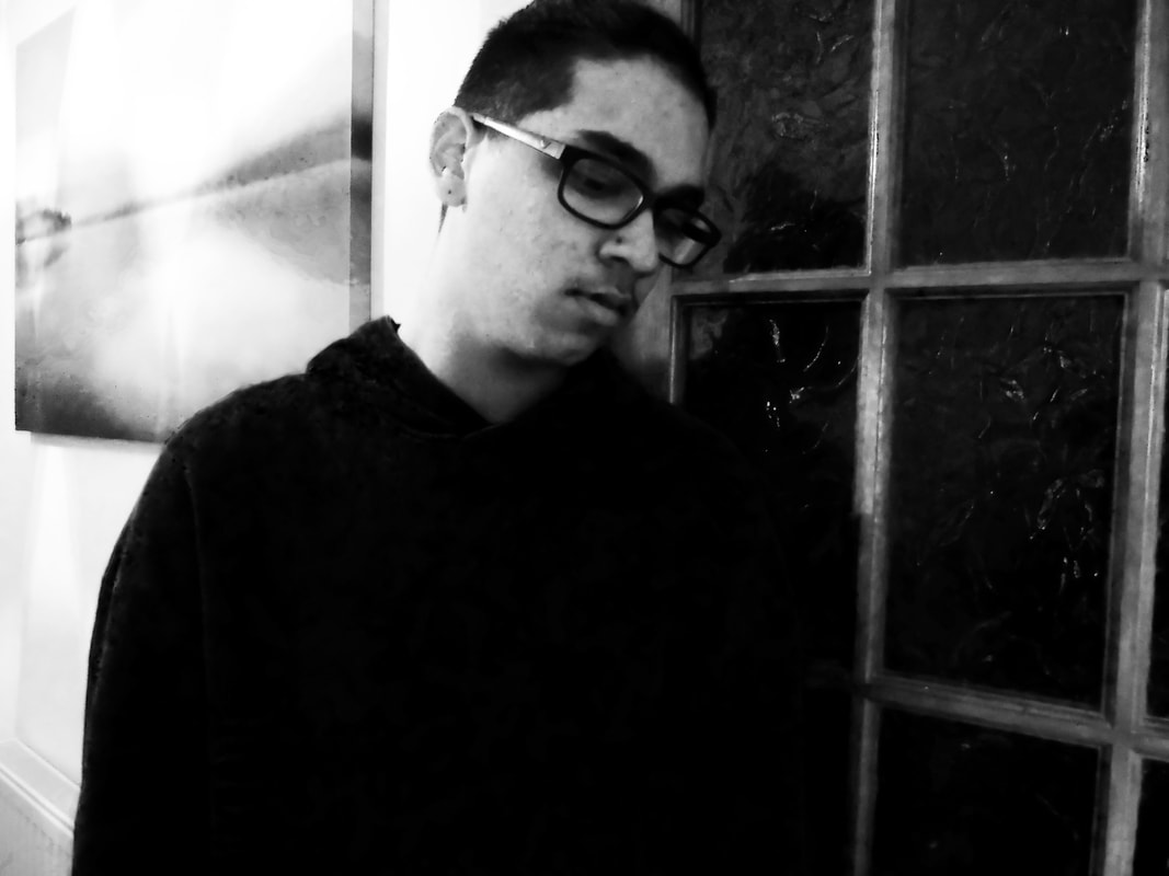
PHOTOGRAPH 2:
my work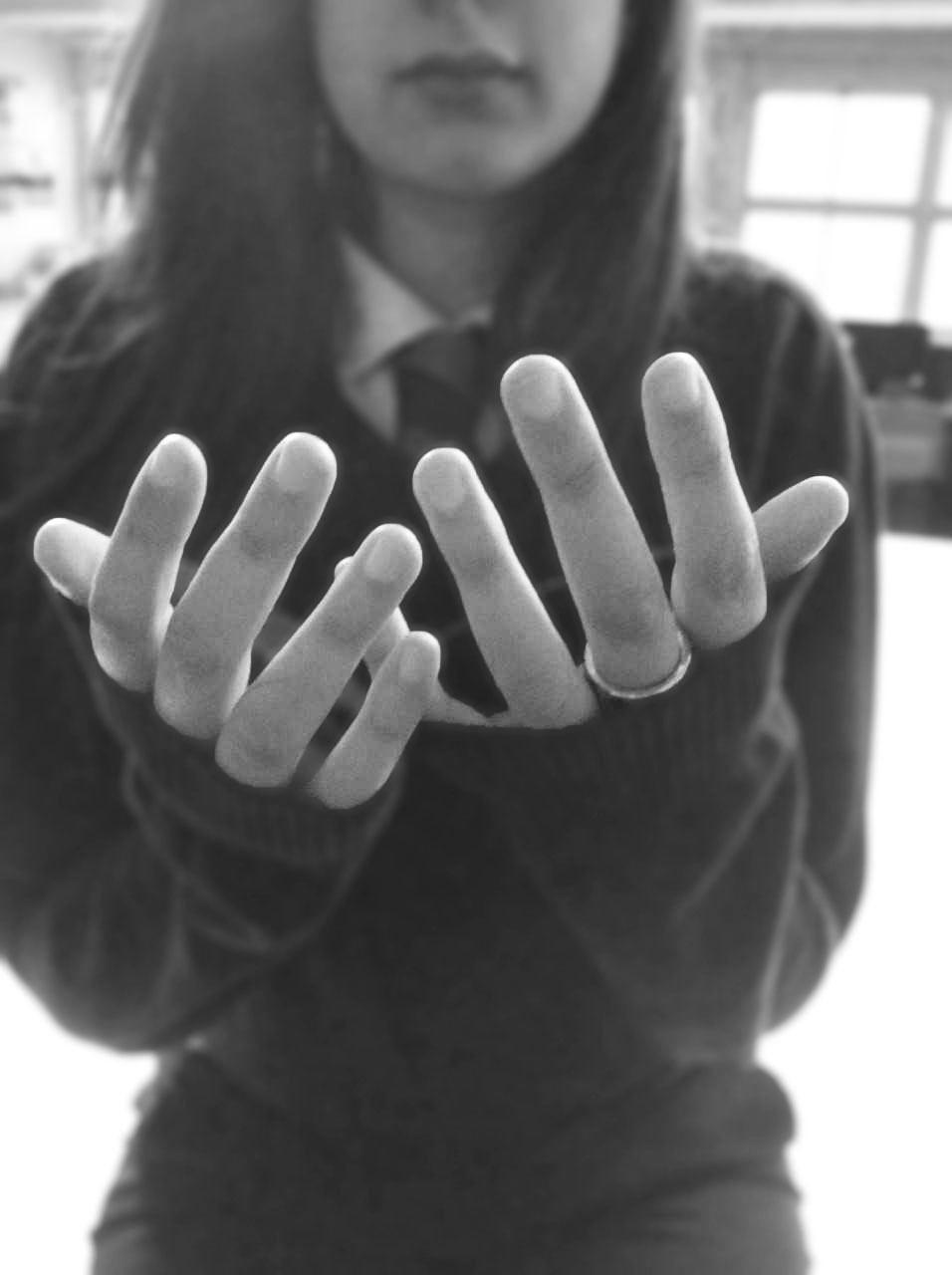
|
artist's work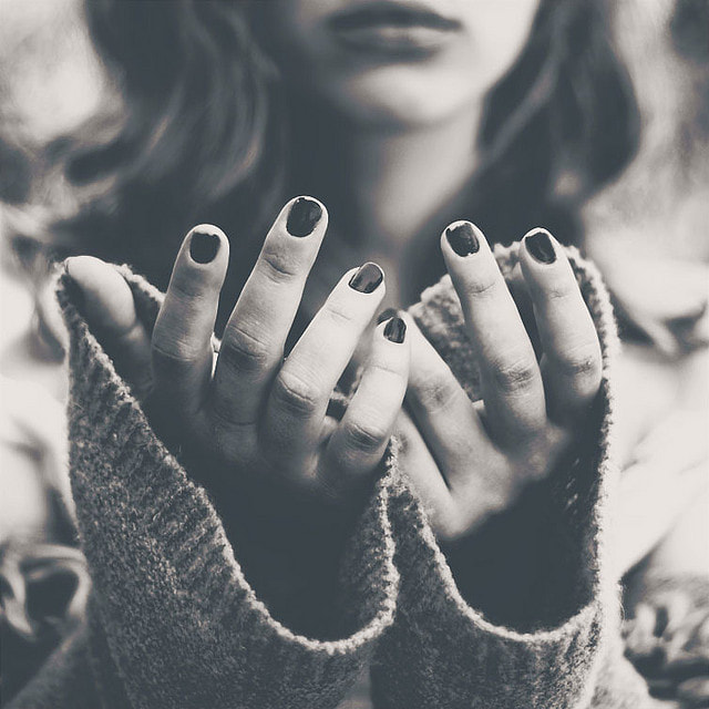
|
I have edited my image to resemble the image which was taken by Victor Bezrukov. In order to edit this image, I used the field blur tool to blur the background so that the sole focus is on the subject's hands. I also applied a black and white filter in order to create the same atmosphere towards the viewer as Victor's image. If I was to re-take this image, I would definitely reconsider the background and spacing of where the subject is placed as she is positioned right in front of a window making it harder to implicate a darker contrast to match Victor's image. I would also zoom into the subjects hands even more to draw the attention away from the background and more onto the subject. When applying the black and white filter to my photograph, I would also darken the reds and cyans within the image in order to match Victor's image.
photograph 3:
|
In order to edit this photograph, I merged the styles of several of the artists images, taking the angles and positions from one photograph but the contrast and brightness from another. After applying a black and white filter and then adjusting the brightness and contrast, I was left with this image. The darkness and high contrast I used gives a peculiar sense to the image and makes the viewer wonder what the model is looking at.
However, if I was to re-take this photo, I would definitely use a camera instead of an iPad to ensure that the quality of the image is the best it can possibly be. |
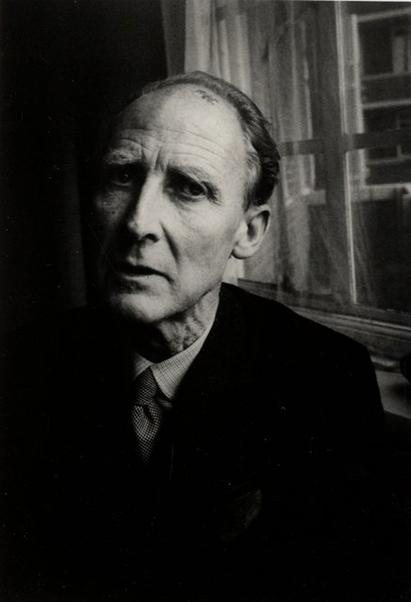
BILL BRANDT
|
|
Bill Brandt was a very influential British photographer who supplied a lot of images for famous magazines like Lillipult and Picture Post. Originally German, he moved to England and became well known for his images of portraits, landscapes and human art. After researching and analysing his photographs, I noticed that in all of his portraiture images, a very dark contrast was used and all of the images were black and white. I began to think about why this had been done and it was clear that the use of these techniques made the one subject stand out as all of his famous photographs are of a single person wrapped in darkness. In most cases, it was images of this old man that were edited in a way to make the viewer almost feel sympathetic towards him as he is being consumed by loneliness.
|

|
This is black and white which adds to the sense of fear and grief within the old man's eyes. The fact that it is a black and white image emphasises the subject more because there are no colours to focus on so the viewer can pay more attention to the subjects emotion. There is daylight shining through the windows on half of the mans face whilst the other half is cloaked in shadows which makes the viewer look at the right side of his face more than the left side.
|
MY EDITED IMAGES IN THE STYLE OF BILL BRANDT:
photograph 1:
my work
|
artist's work
|
I attempted to edit image 1 to resemble certain features of image 2. However, when doing so I found it quite difficult to make the resolution of the image clearer and I also struggled to make the overall focus of the image authentic and not as fictitious. When taking this image, I tried to consider the lighting as one side of the subject's face in Bill Brandt's photograph is darker and more consumed within the shadows whereas the other side is more showcased in the light. However, due to the fact that I had to use flash in order to make the image appear, the introspective time I had spent considering the lighting of the image did not display in the image. I would also reconsider the background of the image and try to darken the background more than the subject in order to achieve the same effect as Bill did.
However, I feel as though one side of my subject's face is in fact slightly darker but next time I will definitely re-take this image during the day and not so much the evening so that the reliance on flash is not as significant. When editing this image in Photoshop, I applied a black and white filter as all of Bill Brandt's images are in black and white. I think that by applying a black and white filter to the image, it emphasises the loneliness, contemplative expression and emotions felt by the subject. When studying Image 1, I realised that the contrast was very high and a deep, stark black was in control of the image which is what I tried to implicate in my photograph whilst editing and I did this through making the brightness a little higher and the darkness/contrast a lot more significant.
photograph 2
|
I edited this image in the style of Bill Brandt in which I tried to mirror the high contrast and brightness of his images which come across as very cold and clinical. Also, in order to do so I simply adjusted the brightness and contrast and applied a black and white filter. The darkness and high contrast gives the image a slight mysterious aura and the viewer is left questioning what the model is looking at so longingly.
If I was to retake this image, I would try to focus the camera more and make sure that the background was clearer. I would also change the position of the lightbox which was placed above the models head in order to mirror Bill Brandt's images more closely as the light source in his images are more on the side of the model's face rather than above it, |
process
Step 1: First I changed the brightness and contrast of the image.
Step 2: Then I applied a black and white filter.
photograph 3

This image was taken in the style of Bill Brandt at a side profile. I found this image quite difficult to edit and work with as it was taken in low lighting, resulting in the quality being very poor so I found that editing it accentuated that a lot. However, I finished this edit regardless, having successfully created the darkness opposing light contrast within the image and that's what made the image most successful.
However, if I was to re-take this image, I would use an artificial light concentrating it next to the models face so that the entire picture wouldn't have to be taken in such low lighting. I would also use a camera to ensure that the quality is of a high standard.
However, if I was to re-take this image, I would use an artificial light concentrating it next to the models face so that the entire picture wouldn't have to be taken in such low lighting. I would also use a camera to ensure that the quality is of a high standard.
Eugene richards
|
|
Eugene Richards began his passion for photography when he first fell in love with a camera before he knew what it could do. He photographs as he has an idea that a lot of people have ordinary lives but some people are forced to fulfil certain things and the fact that he was pushed into a career he didn't want to pursue, drove him to pursue a carer in photography even more. Eugene's images are all black and white but have a slightly brighter contrast than most black and white images. In some of his images, distressed scenes of poverty and social issues are shown and the fact that the images are black and white create an almost authentic sadness felt by the viewer of the image. I also imagine that the fact that there is not a stark black contrast within the image, represents hope shining through the images.
|

|
This is a black and white photograph which is trying to express the sorrow felt by the subject within this image. His eyes are shut to draw more attention towards the tears on his cheek. The little bit of background that is shown is blurred to draw more attention towards the mans facial expression. There is also a more honed in rule of thirds demonstrated in this image to give unique viewpoint. There is a contrast between shadows and brightness as half of the subjects face is lit with what seems like natural lighting whereas the other half is enveloped in a slight darkness.
|
MY EDITED IMAGES IN THE STYLE OF EUGENE RICHARDS
photograph 1:
my work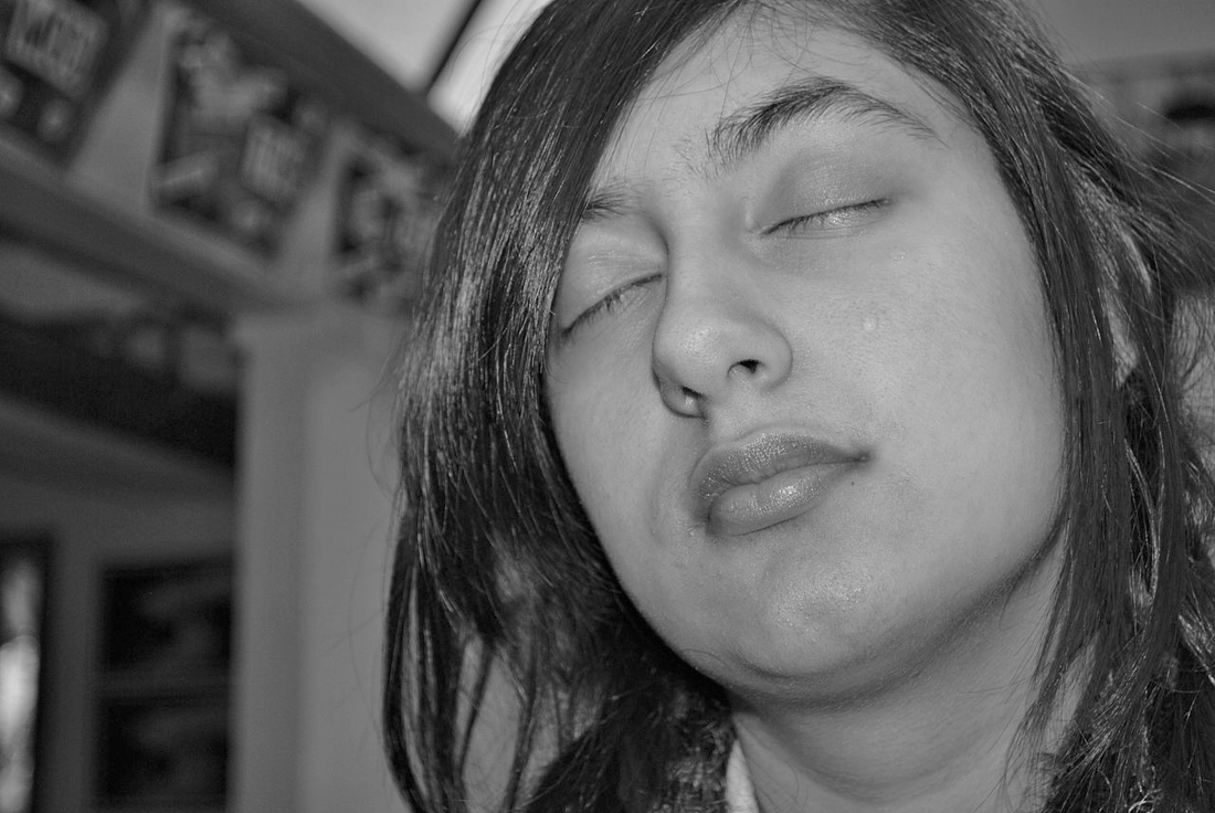
|
artist's work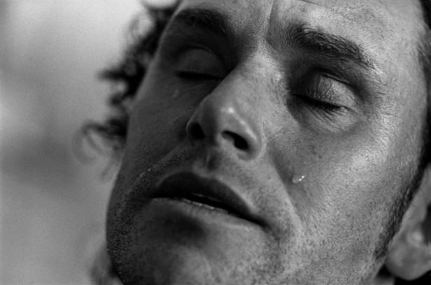
|
I edited image 1 in order to resemble image 2 which was edited by Eugene. When capturing this photograph, I tried to consider the lighting of the to make it similar to Eugene's image. By thinking more about the lighting and background of the image, it made my image appear more authentic and professional. To edit this image, I applied a black and white filter but kept the reds, greens, magentas and cyans relatively high so that the image would appear brighter and not as dark like I did for Bill Brandt's images. However if I was to retake this photograph, I would capture the image whilst the camera is slightly lower so that the flash of the camera will shine upon the tear on the subjects face so that it becomes more visible.
photograph 2:

I also edited this image in the style of Eugene Richards. In the process of taking this image, I carefully zoomed into the subjects face to ensure that the focus of the image would not turn out blurry or have a poor resolution. I also made sure that the background was clear so that the sole focus of the image was the subjects empty and thoughtful expression. When editing this image, I applied a black and white filter and decreased the brightness in order to emphasise the emotions felt by the subject but to also showcase an overall despairing atmosphere. In the future, I would consider slightly changing the angle in which the photograph is taken in so that more of the subjects face is shown and less of the background.
photograph 3

This image was taken in the style of Eugene Richards. When selecting which image to mirror, I took certain aspects from all of his images to create this edited photograph in which I purposely selected a simple pose so that I could focus on the actual quality of the image itself. When editing, I simply applied a black and white filter and adjusted the brightness and contrast of the image, making sure not to tarnish its quality. I think that the finished and edited image is very simple but of a high quality which is a main aspect of Eugene's work. By editing it this way, I think that the image is quite mysterious in the sense that all the focus is on the model hence the focus is on what she is looking at.
If I was to re-take this image, I would potentially change the facial expression of the model to convey a particular message like all of Eugene's images do as I feel like my photograph has no real meaning behind it.
If I was to re-take this image, I would potentially change the facial expression of the model to convey a particular message like all of Eugene's images do as I feel like my photograph has no real meaning behind it.
final idea
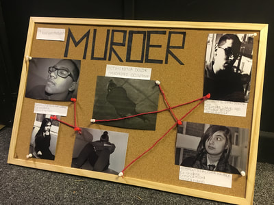
For my final idea, I needed to combine all the features of my chosen artists to create one piece. When looking more in depth into Victor Bezrukov, Eugene Richards and Bill Brandt's work, I realised that all artists interpreted a sense of loss and grief in their photographs which was perceived through the use of black and white filters and sadness within the subjects eyes/ their facial expressions. This common theme lead me to think of the loss of a loved one or the loss of something you love as in quite a few of the images, the subjects were crying and in all the images, the subject was alone which was almost like they were alone in their grief. This then lead me to think of a theme which may have been interpreted in many of the artists photographs which was death. After thinking of this, I knew that I had to come up with an idea which would allow me to showcase images I have taken in the style of these artists but also show a common theme of death whilst applying my own modern twist on it. This was when I thought of a police investigation board. An investigation board is a way in which the police force connect clues and evidence which link to an act of crime which is commonly murder which tied into the common theme I wanted my work to show.
However, in order to link all my work together, I needed to research another artist which would help tie all my work together but also follow similar photo editing skills that my other chosen artists did. After researching, I came across an old fashioned photographer called Weegee who took photographs of re-enactments of murders and serial killer jail scenes. Some of his photographs are real crime and murder scenes.
However, in order to link all my work together, I needed to research another artist which would help tie all my work together but also follow similar photo editing skills that my other chosen artists did. After researching, I came across an old fashioned photographer called Weegee who took photographs of re-enactments of murders and serial killer jail scenes. Some of his photographs are real crime and murder scenes.
WEEGEE- ARTIST RESEARCH FOR MY FINAL IDEA
Weegee was a photographer and photojournalist best known for his striking black and white street photography. This artist commonly took photographs of crimes, murders and serial killers and due to the stark black and white casts, they give off quite an eerie and chilling sensation to the viewer. One of his images really emphasised why I chose him to tie all of my work together which was the following the image:
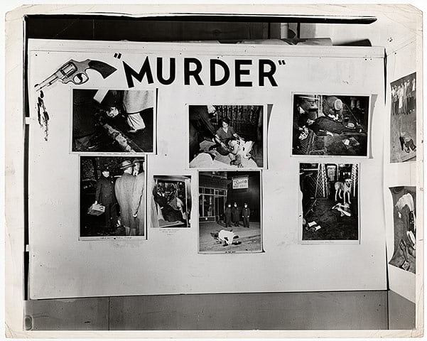
This image tied my work together perfectly as it was very similar to what I wanted to produce for my final piece but in order to incorporate my own style of more modern and clinical art I wanted to produce something more like this but as a mixed media piece:
final outcome:
|

|
|
THE FOLLOWING IMAGES ARE OF MY FINAL IDEA BUT ARE EDITED:
edit 1:
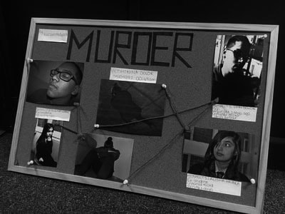
|
I have applied a black and white filter in order to emphasise the vintage and authenticity behind my work. I have used a black and white filter so that it seems older as I wanted to have two styles to my final piece, one being modern and the other being vintage. I then increased the contrast and brightness in order to create a dark and creepy effect.
|
Process
Step 1: I applied a black and white filter.
Step 2: I then adjusted the brightness and contrast to make the image darker.
EDIT 2:
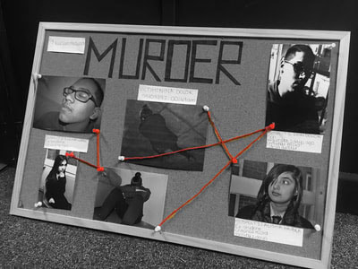
|
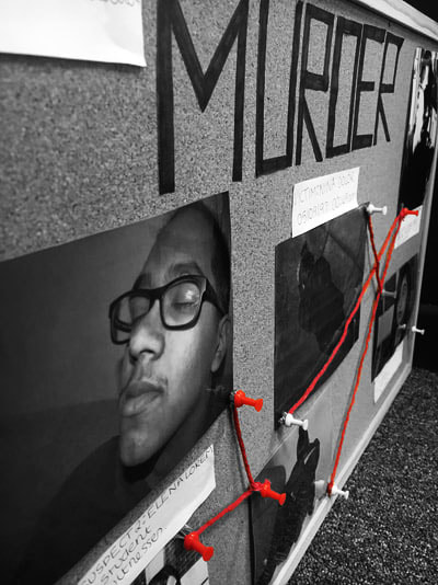
In order to edit these image of my final piece, I selected the red string of the image and then selected the inverse. I applied a black and white filter on photoshop and increased the blue, yellow and cyans in order to darken the overall contrast of the image in which I also increased the contrast and lowered the brightness to give the image an overall eerie and murderous atmosphere. Once I deselected the image, I was left with a black and white image with a bright red group of string tieing the images together. I did this to create a sense of symbolism of blood to my work in order to emphasise the theme of death. After doing so, I also realised that it could been symbolic of anger and hate which could have been a motive towards the death of the character in my narration.
|
OTHER EDITS IN THIS SAME STYLE:
|
|
PROCESS
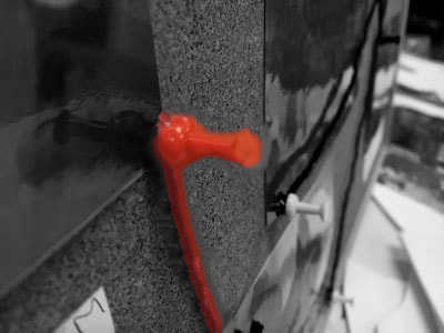
Step 1: I used the quick select tool to select the red string.
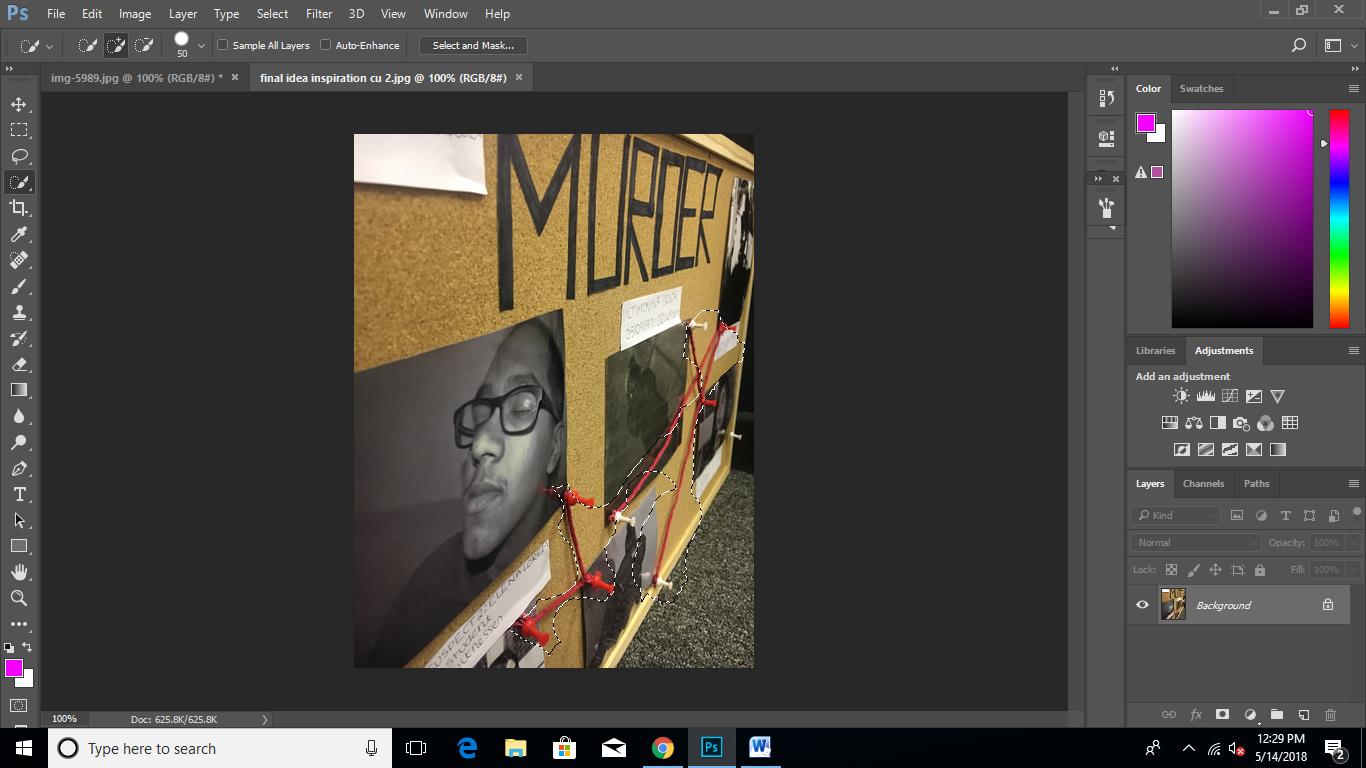
Step 2: Select inverse.
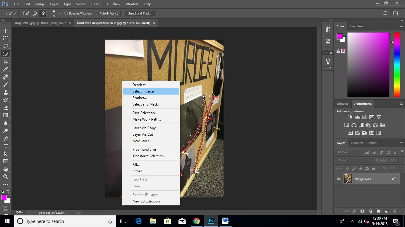
Step 3: I then applied a black and white filter which would effect everything other than the red string.
sELF-EVALUATION
When I was creating my final piece, it turned out quite successful as I was able to create the modern look I wanted my final piece to have and under the designated time. However, if I was to re-take this exam and re-create my final piece, I would definitely have more initial photographs edited and printed so that I would have a wider range of suspects on my murder board so that the narrative point of my board would be more clearer and realistic. Also when I was preparing for my exam, I forgot to email one of my images to be printed which resulted in me having to print it out. Because I didn't send the photograph, I had to print out the image myself and as the image is of a high contrast and has very dark lighting, the image turned out to be of a poor quality when printed. This image was the centre of my final piece as it was the the photograph of the victim so the poor quality downgraded my work a little.
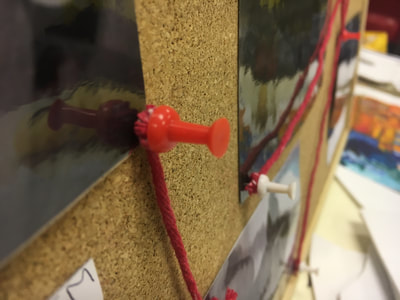
In order to create my Final Outcome, I printed out a selection of my edited images and I then cut them out and laminated them. After that I wrote the word 'Murder' on a sheet of paper and cut out to stick onto my board. Then I attached then images to the cork board with red and white drawing pins and red string. Due to the fact that I had extra time, I created mini fact files about each of the suspects in order to make the murder board seem more realistic and authentic but also to give it a more narrative twist.
In order to create my Final Outcome, I printed out a selection of my edited images and I then cut them out and laminated them. After that I wrote the word 'Murder' on a sheet of paper and cut out to stick onto my board. Then I attached then images to the cork board with red and white drawing pins and red string. Due to the fact that I had extra time, I created mini fact files about each of the suspects in order to make the murder board seem more realistic and authentic but also to give it a more narrative twist.
