why have i chosen this title?
I have chosen the title 'light and dark' because I have a keen interest in specific colours and contrasts of images and this title allowed me to focus on that. When completing my Unit 1-Portraiture work, I only focused on black and white photography which expanded my interest in that type of photography. I also chose this title as it would challenge me in the sense that I knew I would be doing black and white photography in it and trying to express a certin concept to a viewer without the help of colour would be very interesting.
FIRST ARTIST: Joshua Brangenberg
|
|
Joshua Brangenberg is a nature photographer who feels strongly about changing the viewers perspective of nature and it's story. A lot of his wok follow the same pattern in which almost all of his work is in black and white and although there may be more than one subject, extra attention is always bought to one thing in the image which is what I discovered when studying his photographs.
|
ANNOTATIONS:
|
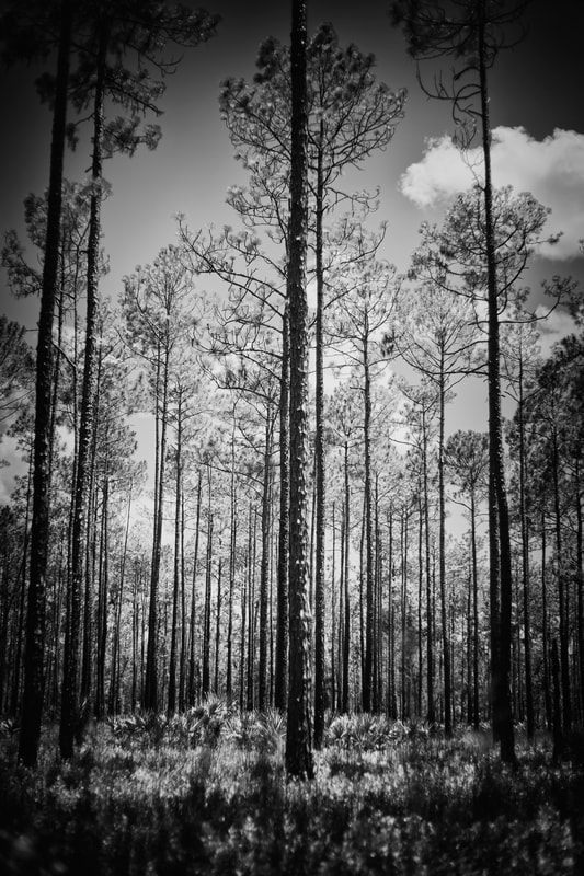
This image shows a group of trees all of a similar shape and height. Directly in the centre of the image, there is an oddly tall and peculiar tree that almost gives the impression of that one tree being a lot more forwards than the others which creates a sense of empowerment through nature. When looking at this image it could be said that it makes the viewer feel quite intimidated due to the fact that it's taken at a lower level. It is quite clear that there is no artificial lighting being used in this image but a black and white filter has been applied to almost emphasise the darkness and strength of the trees. I also think that the brightness of the image has been altered because there are very few clouds in the sky suggesting that it was taken when it was quite bright out however, the image itself doesn't appear to be making it seem like the brightness was lowered.
|
My unedited images in the style of this photographer:
Here is a selection of unedited images taken in the style of Joshua Brangenberg. Whilst taking the photographs, I focused a lot on the angles, lighting and clarity of them in order to achieve the simplistic yet beautiful view that Brangenberg does.
My edited images taken in the style of joshua brangenberg:
The editing process for all of my images taken in the styles of Joshua Brangenberg are very similar, as this photographer focused more on the process and quality of capturing the image rather than the editing as clearly shown by his work. I tried to follow the same concept thinking more about taking the image so that minimal editing was required to improve other factors like quality and sharpness.
|
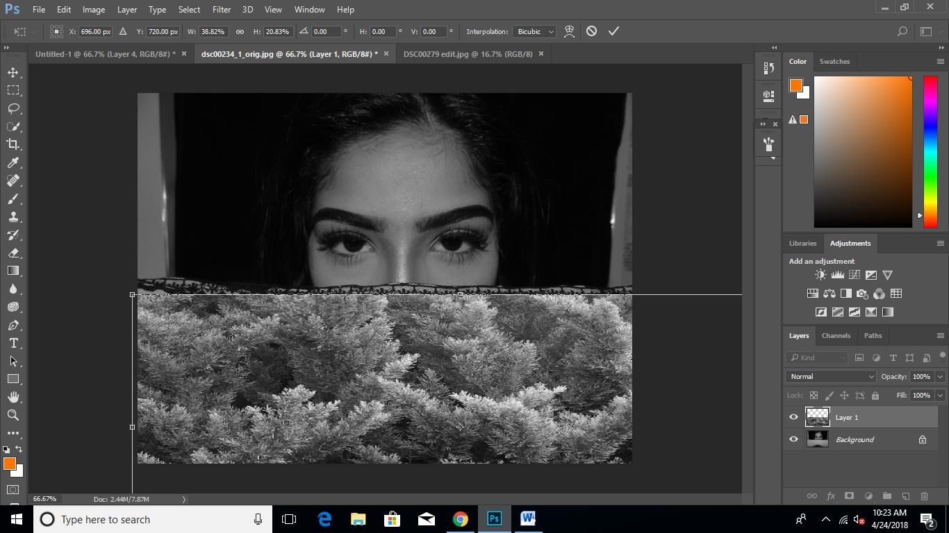
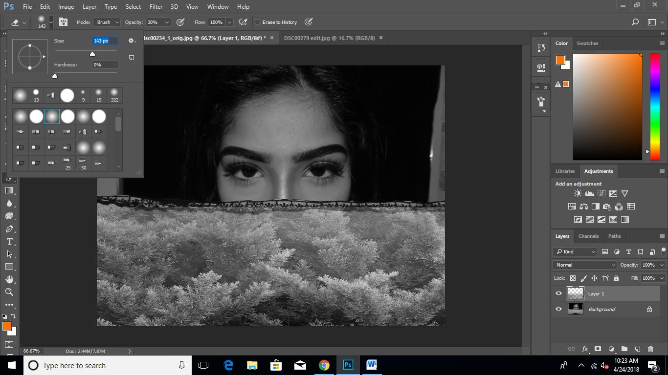
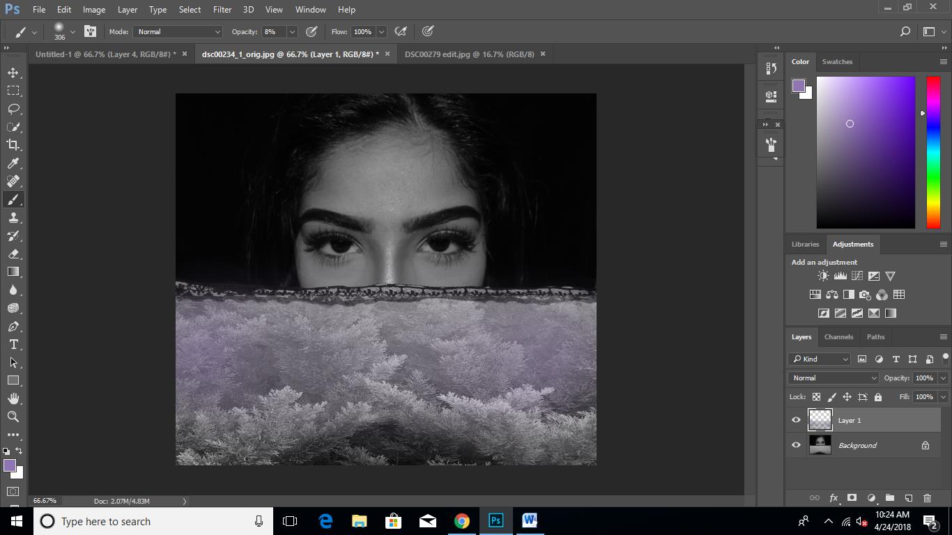
In order to edit this photograph, I applied a black and white filter and intensified the cyans and greens quite a lot so that the image would appear even darker when I changed the contrast. After that, I lowered the overall brightness of the image and intensified the contrast in order to create the dark and eerie atmosphere that some of Brangenberg's give off further implicating the concept of natures power. Lastly, I used the brush tool with the colour black and lowered the opacity to 5% and then coloured the edges of the image, mainly focusing on the bottom of the image.
If I was to retake this image, I would try to include more of a subject in the image in the sense that there isn't really anything that the viewer can focus on which is not the case in most of Brangenberg's images. |
|
To edit this image, I simply applied a black and white filter and lowered most of the cyans, greens and yellows to make the image more grey than black. Then a increased the contrast and slightly increased the brightness to hone in on the leaves. The editing process for this image was very simple as I wanted the sole focus of the photograph to be on the shape and texture of the leaves emphasising the intricacy of nature.
However, when looking back at this image , I realised that it wasn't closely linked to any of Brangenberg's images in terms of the angle of the image. Although the editing was in his style and the concept, next time I would definitely reconsider the angle of the image to get a photograph that mirrors the artists work closer. |
|
When taking this image, I focused on the particular angle I wanted it to be taken in as Brangenberg's images always have a background are not taken really close up. In order to edit this image, I applied a black and white filter and darkened the greens significantly so that they clash with the intensity of the white sky. Secondly, I increased the contrast and brightness quite a lot so that the tree would stand out more and the concept of the darkness and mystery of nature was quite clear when viewed.
If I was to retake this image, I would definitely try taking i when it is significantly darker so that I could darken and intensify the contrast without affecting the quality of the photograph. |
|
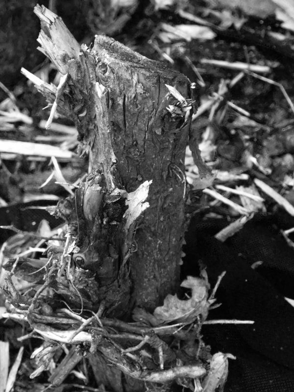
To take this image, I zoomed into the stump of an old tree and ensured the clarity and resolution was as clear as I could possibly make it. Then when editing, once again I applied a black and white filter, focusing particularly on darkening most of the colours to get the darkest contrast I could between the bark pieces and the tree stump. I then increased both the brightness and contrast of the image in attempt to mirror Brangenberg's work. Lastly, I took the brush tool with the colour black on opacity 2% and coloured the tree stump slightly so that I could really emphasise it compared to the bright white bark pieces.
Howvever, if I was to retake this photograph, I would consider the angle more because in the image I tried to replicate, Brangenberg subtly used the rule of thirds when capturing the image of a snapped tree and the stump. |
|
|
Other edited images in the style of this artist:
|
SECOND ARTIST: BABAK FATHOLAHI
|
Babak Fatholahi is a portrait photographer that is based in Tehran. Quite a lot of his work has been published in many fashion and beauty magazines all over the world. Babak's work ranges from dark and mysterious black and white images to pure and raw coloured images. Here is a selection of his work ranging from all of his released collection:
|
I have selected the following images to use in my exam because they follow a similar black and white, studio theme which I can easily manipulate into my own style of photography. Most of the images here are from the Parisienne Moonlight exhibition published by Dark Beauty Magazine:
|
|
|
|
Annotations:
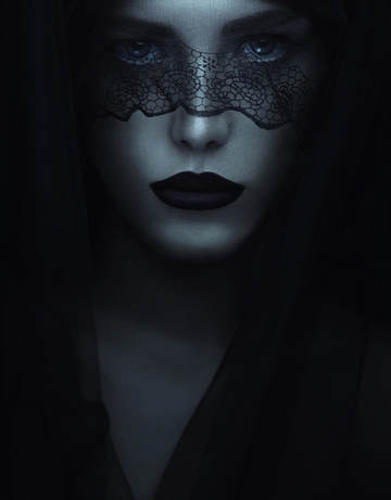
TITLE OF IMAGE: "ISOBEL"
|
This image shows a woman draped in a lace headpiece staring directly into the lens of the camera. When looking at this image, a strange almost ghostly atmosphere is created and felt by the viewer. Also the model has a very blank facial expression which comes across as almost a sense of grief or loss. Due to the fact that the image is heavily honed in onto the model's face the location in which the photograph was taken remains unknown but I personally think that it is most likely that the image was staged and taken in a studio using an artificial blue toned light source. By using a stark blue toned light source it makes the image appear quite manipulated and fabricated.
|
The first thing that attracted me to this image was the models eyes because they shine straight through the black lace and they also have a very peculiar expression. Also, they are heavily highlighted especially along her waterline which makes her eyes stand out even more. Personally, I really like this image because the message of the picture is not clear at all which adds to mysterious atmosphere created by the image. Also, the image has a lot of intricate details that really impact the way the image is viewed. For example, the glimmer in the model's eyes, the darkness of her lips and the brightness of the centre of her face. This image makes me feel apprehensive because the model is staring into the lens which makes it seem like she is staring into my eyes making me feel quite intimidated as well.
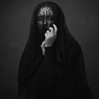
title of image: "Parisienne moonlight"
|
The following image shows a woman dressed in all black clothing with a layer of lace cover all of her face. When looking at this image, an eerie and mysterious atmosphere is created as we we as viewers are left wondering: What the lace is symbolic of? It is clear that the photographer has used an the artificial setting and lighting of a studio in order to produce the clinical and cold environment shown. The image has been edited to with a black and white filter which emphasises the mysteriousness and peculiarity of the woman in the photograph.
|
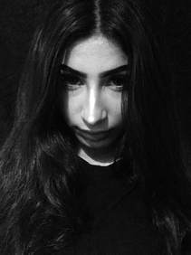
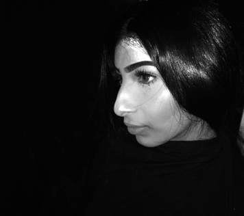
MY UNEDITED PHOTOGRAPHS IN THE STYLE OF THIS PHOTOGRAPHER:
The following images are of my unedited images in the style of Babak Fatholahi's work in which I tried to take photographs to link closely to the inspiration I found within his work.
My edited photographs in the style of babak fatholahi:
|
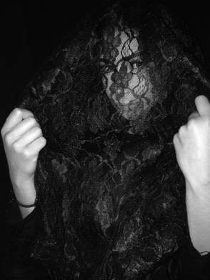
When editing this photograph, I took inspiration from Babak's image called 'Isobel.' Firstly I took a photograph of the model with black lace draped across half of her face, using a camera to ensure the quality and resolution of the image was high. In order to edit this image, I used the dodge tool to brighten the centre of the model's face and add a slight gleam to her eyes. I then used the hue/saturation tool to draw some of the warmth out of the picture decreasing the saturation and turning the picture ore blue by increasing the intensity of the cyan so that I could imitate the stark light used by Babak. If I was to retake this image, I would try to get the same type of material Babak used in his work so that the eyes of the model were more visible so that the emotion conveyed by them would be clearer.
|
|
I took this photograph in close link to the picture of 'Saharnaz.' In order to capture this, I made sure that the background was clear so that the sole focus of the image would be the model's face as that is the only component of Babak's image. To edit this, I simply applied a black and white filter and used the dodge tool to highlight and accentuate the model's eyes. If I was to retake this I would make sure that the camera is in full focus and that the photograph was taken more close up so that I could resemble Babak's image more closely.
|
|
In order to capture this photograph, I made sure that the background was completely black so that all the focus would be on he model and the pattern of the lace. I then used a camera with flash to mirror the artificial lights Babak used but also to ensure that the model's face was bright and visible under the lace. To edit this I turned the image to black and white and used the dodge tool to highlight the models eyes in order to make them more brighter and visible. If I was to re-take this image, I would use a camera in order to increase the clarity and resolution of the image which would then make the model's eyes brighter and more visible.
|
|
In order to edit this mage, I increased the contrast and applied a black and white filter to reflect Babak's work. I then used the dodge tool in the centre of the model's face. However, looking back on this edited photograph, I can clearly see that the contrast is too intense which drowns out the background too much. If I was to re-take this image, I would definitely use an artificial light of a higher intensity so that the background is not as drowned out and not as stark black.
|
design idea work:
|
|
The following images are inspired by Babak Fatholahi but I have thought more about using different materials and poses to make the images my own.
|
exam practice edits (my images fused with JOSHUA BRANGENBERG's images)
|
|
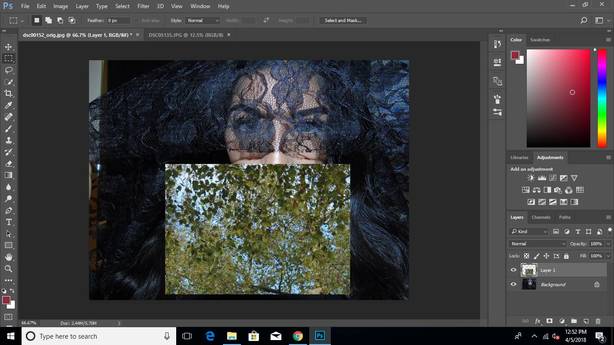
Here, I edited an image that I took in the style of Babak Fatholahi an I then layered a snippet of Joshua's nature and landscape photographs in order to morph the idea of fashion and nature together.
|
using only my images:
|
|
I have used the same concept but instead of using Joshua's nature pictures, I have used my own taken in his style. This was achieved through pasting a nature image on top of the picture of the model and with the eraser on a very low opacity, I blended out the edges to allow the base image to come through.
|
EXAM WORK:
|
|
I created these edits in order to achieve a higher contrast between the imprinted scarfs and the base model image. After creating these edits, I found that they followed the theme of 'light and dark' quite well as the high contrast and darkness of the background contradicted the brightness and colour of the nature embroidery scarfs.
|
Process of creating these edits:
Step 1: Firstly I applied a black and white filter to the image and adjusted the colours till I had my desired look.
Step 2: Then I copied and pasted a macro photography picture of a tree and adjusted its size in proportion to the models scarf.
Step 3: After that I used the eraser tool and lowered the opacity to 15% to blur the edges and blend the image into the scarf.
Step 4: Lastly, I used the brush tool and selected my desired colour. Then I changed the opacity to 5% and increased the brush size to over 300. I lightly began to colour the top half of the scarf, blending as I got towards the bottom with an even lighter colour.
PRACTICE FINAL IDEA USING MY IMAGES AND JOSHUA BRANGENBERGS:
|
|
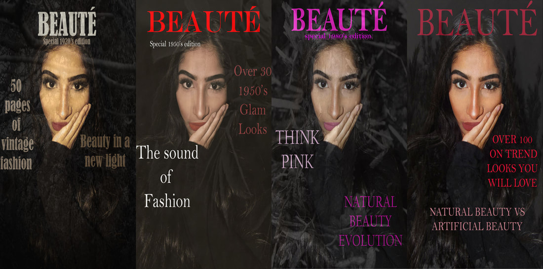
In order to combine the idea of nature and fashion, I came up with the idea of making magazine covers that address the idea of 'Natural Beauty Vs Artificial Beauty'.
|
Magazine covers using only my images:
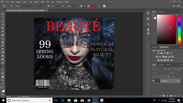
Here I edited a number of magazine covers using only my pictures taken in the style of Babak Fatholahi and Joshua Brangenberg.
hOW I CREATED THESE MAGAZINE COVERS:
Step 1: Firstly, I copied my selected nature picture onto a picture of my model.
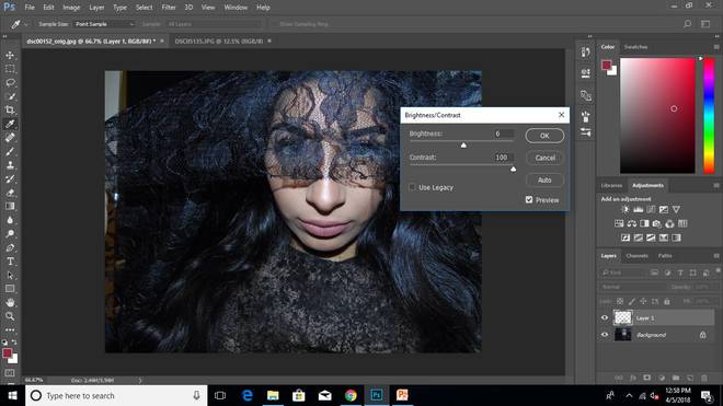
Step 2: Then using the eraser, I erased the image to fit the models top and then I lowered the opacity to 28% to blend the images together. I also darkened the image to make it seem less harsh.
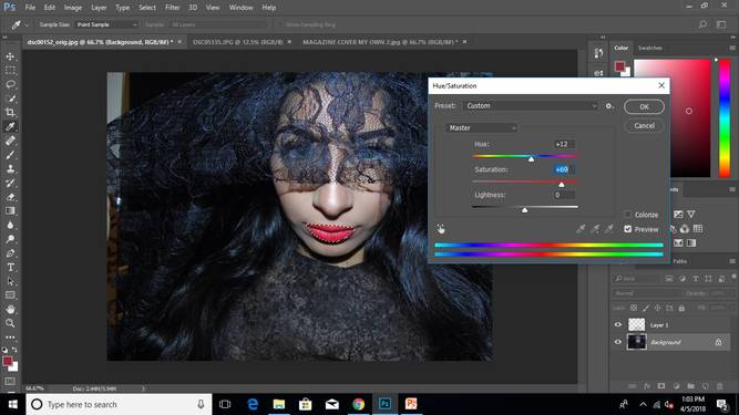
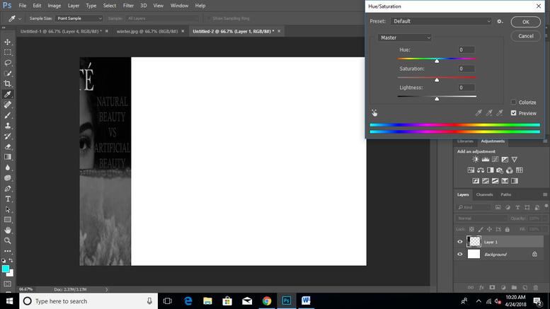
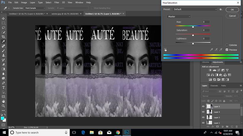
Step 3: Thirdly, I changed the colour of the models lips to bring some colour and life to the image. I did this by selecting her lips by using the quick selection tool and changing the hue saturation.
Step 4: Lastly, I used the text tool to add all the titles that a magazine cover would normally have and I decided to name my magazine 'Beauté' which is french for beauty.
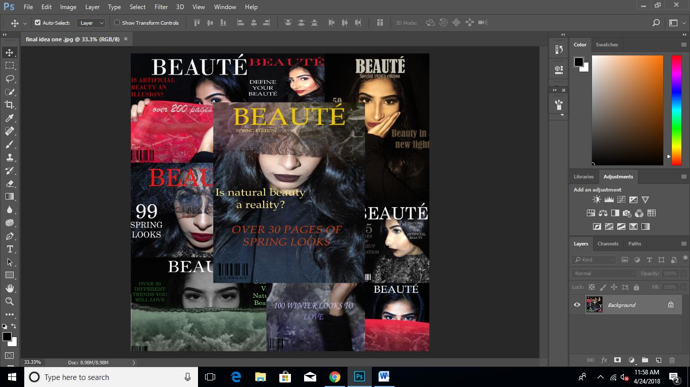
FINAL IDEA 1:
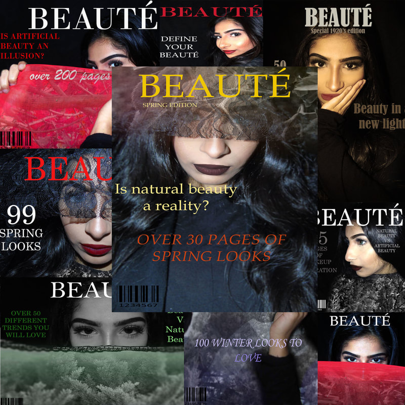
HOW I CREATED THIS:
Step 1: Firstly I layered all of my magazine covers on top of each other to create a collage.
Step 2: Lastly I edited a magazine cover especially for the front of the collage that I had not used before.
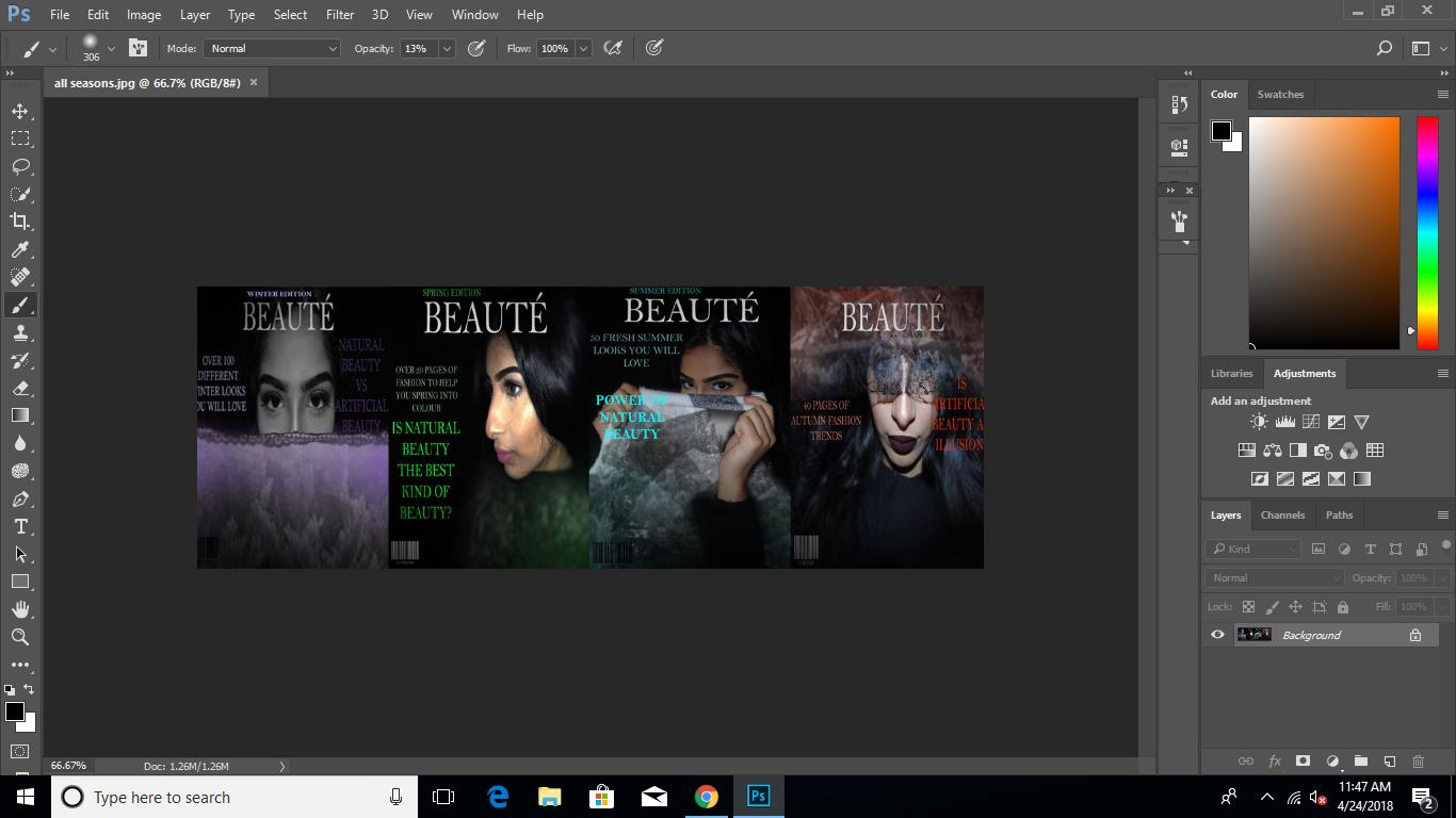
Final idea 2:

How i created this:
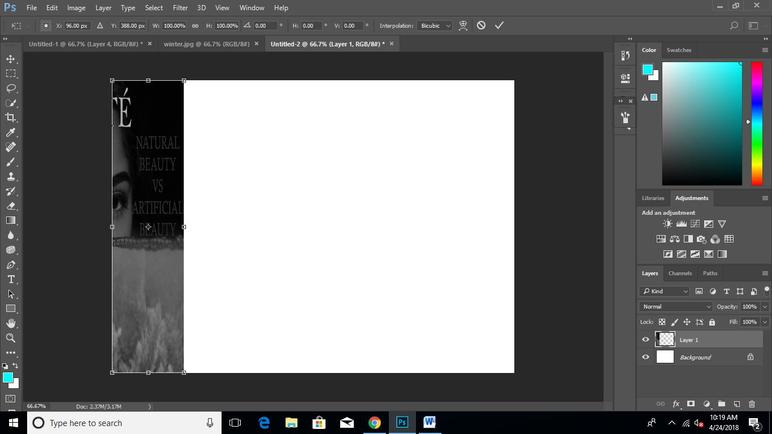
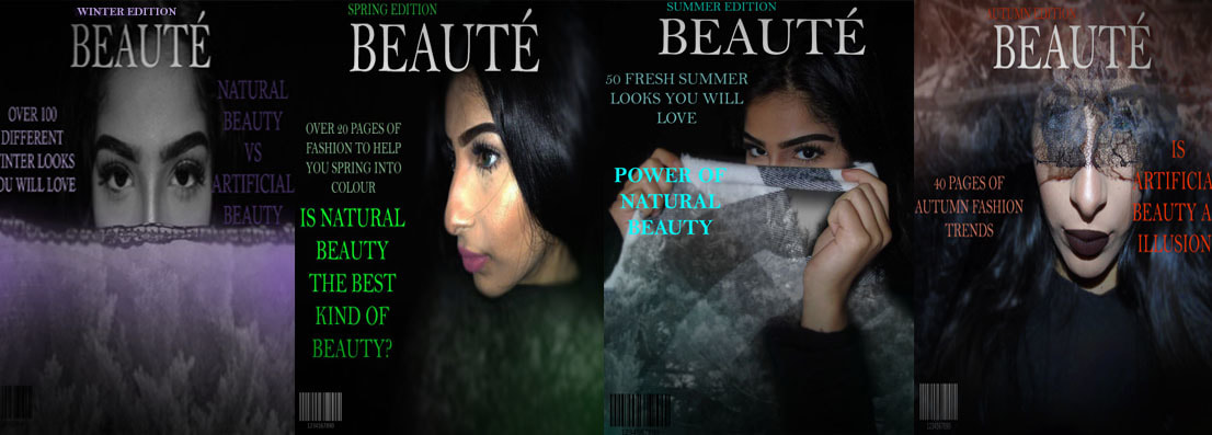
Step 1: Firstly I made magazine covers by editing my photographs in the style of Babak Fatholahi and pasting images taken in the style of Joshua Brangenberg on top (process shown above) and then placing the magazine text on top aswell. I created four different magazine covers for winter, spring, summer and autumn.
Step 2: Then I copied and pasted the winter edition onto a blank canvas and continued until all four had been uploaded.
Step3: Lastly, I used the brush tool with the colour black on opacity 13% and slowly shaded the edges of the magazines.
Final idea 3:
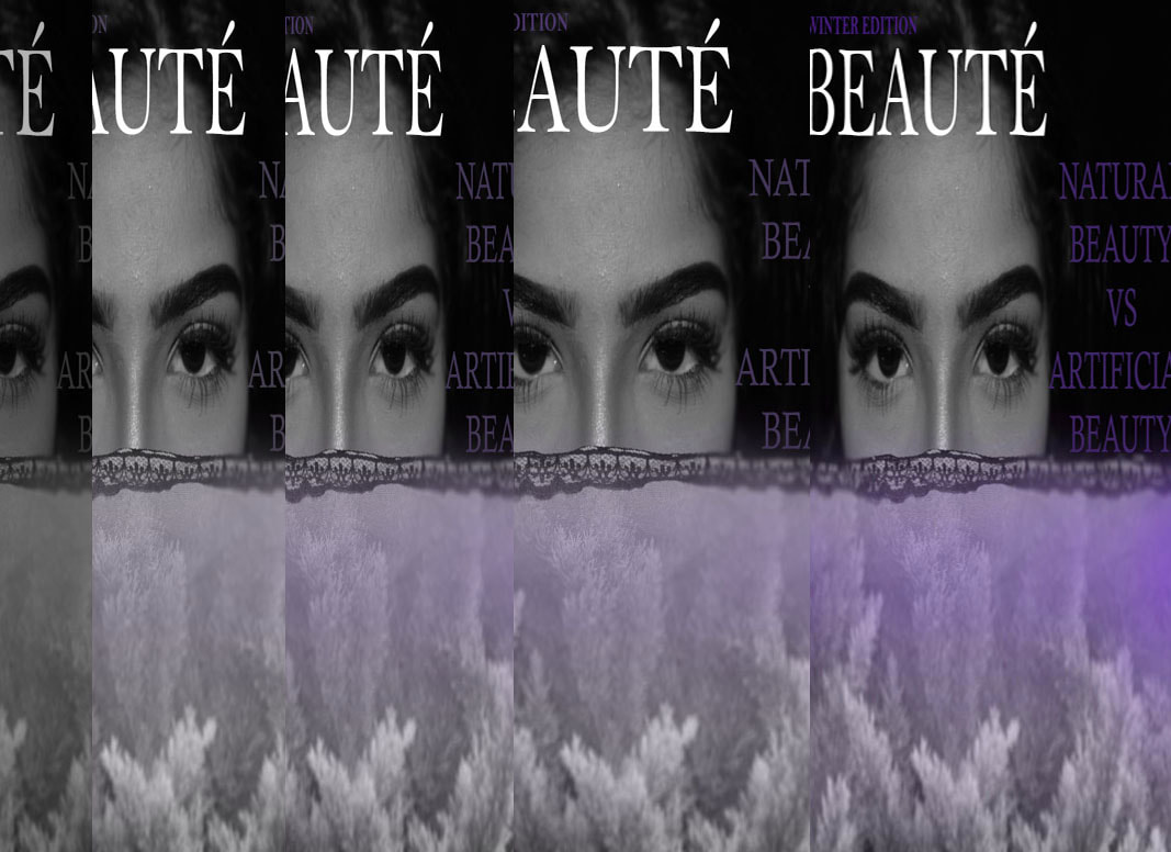
How i created this:
Step 1: Firstly I copied a section of a magazine cover and lined it up with the edge of the canvas.
Step 2: Then I changed the saturation down until the image was black and white.
Step 3: I repeated this but lowered the saturation a little less each time until I increased it on the last copy.
fINAL IDEA 4:
why did i create this?
I created this final idea to show different styles of editing within the tones and hues of the images. For example, the 1950's edition had a very bright title but very muted colours within the actual image so this required me to alter the saturation and hue of the image whereas magazines in today's time are very bright and the images themselves are quite vivid as well. By creating this, my concept of natural beauty and artificial beauty was still expressed but this time, focusing on how the ideas and views on beauty have changed throughout the eras.
how i created this:
Step 1: Firstly I edited the same image multiple times in the style of each different era and then I copied and pasted a nature picture onto the magazine cover using an eraser at opacity 30% to make it appear transparent.
Step 2: Then I copied and pasted all the images onto a blank canvas to complete the collage of "beauty throughout the ages".
MY CHOSEN FINAL PIECE:
evaluation:
My final piece turned out quite successful as I was able to easily portray the concept I wanted which was 'Natural Beauty VS Artificial Beauty' through a creative and original way. My time management over the course of the two five hour exam periods was very good because I was able to create multiple magazine covers all in different styles and eras which then made it quite easy for me to come up with so many different final pieces in which I chose the one above as my final piece for my exam. Through each final idea I created, I was able to showcase a different skill and learn more about it , for example, in final idea 3 I focused on the tones, saturation and hues whereas in final idea 1, I heavily relied on layering in large quantities whilst maintaining a good quality.
My final piece fits the exam question quite well as I have the darkness and intensity of the base images of the model which give off the coldness and peculiarity of some of Babak's images which I tried to mirror and scarfs and clothing that I layered with my nature photographs which are all emphasise the 'dark' aspect of the tile. On the other hand, I have the coloured tints that I have applied to the materials and the vivid text on the magazine covers acting as the 'light' aspect of the title that create a stark contrast. I have purposely created this contrast as I wanted to find more creating ways of expressing my concept and this contrast symbolises the opposing opinions on the ideas of artificial beauty shown the media and the natural beauty of everything that isn't really focused on. With the text on my magazine covers, they simply state natural beauty and artificial beauty without specifics about what each one really means, I have purposely done this so that viewers can create there own ideas and concepts about what artificial beauty really is. I wanted viewers to question where the barrier between artificial and natural lies, where the barrier between reality and expectations lie,
If I was to re-take this exam again, I would definitely come up with ways to make the magazine covers more authentic because they seem quite unrealistic as magazine covers and I feel as though the way I have perceived the images may lead away from the concept I am trying to express, By this, I mean that the bold text and what the text actually says may distract viewers away from the actual images and contents of them. I would also consider creating one less final idea as it would have given me a little bit more time to work on the analysis of all of my final ideas rather than just stating the process in which I made the with a brief analysis.
